Toshiba Android app
Android tablet app to be used by the UK Toshiba sales team as a digital catalogue for their tablet, PC and TV range. The app pulled data and imagery from the Toshiba website, but presented it in a more engaging manner, with a sales-centric focus. We built the ability for staff to create targeted presentations to be used to showcase specific model ranges to large UK retail chains such as Dixons, Argos and Curries. By filtering out products which may not be relevant to a particular store, the staff are able to more quickly navigate between their chosen products.
I was the sole designer for this project and worked closely with the account manager, project manager and developers. Whilst initially designed for the UK market, it was to eventually be rolled out right across Europe. We also built a similar app for Mitsubishi in the same year.
Client: Toshiba (EU).
Designed at Net Mobile, London, 2012.
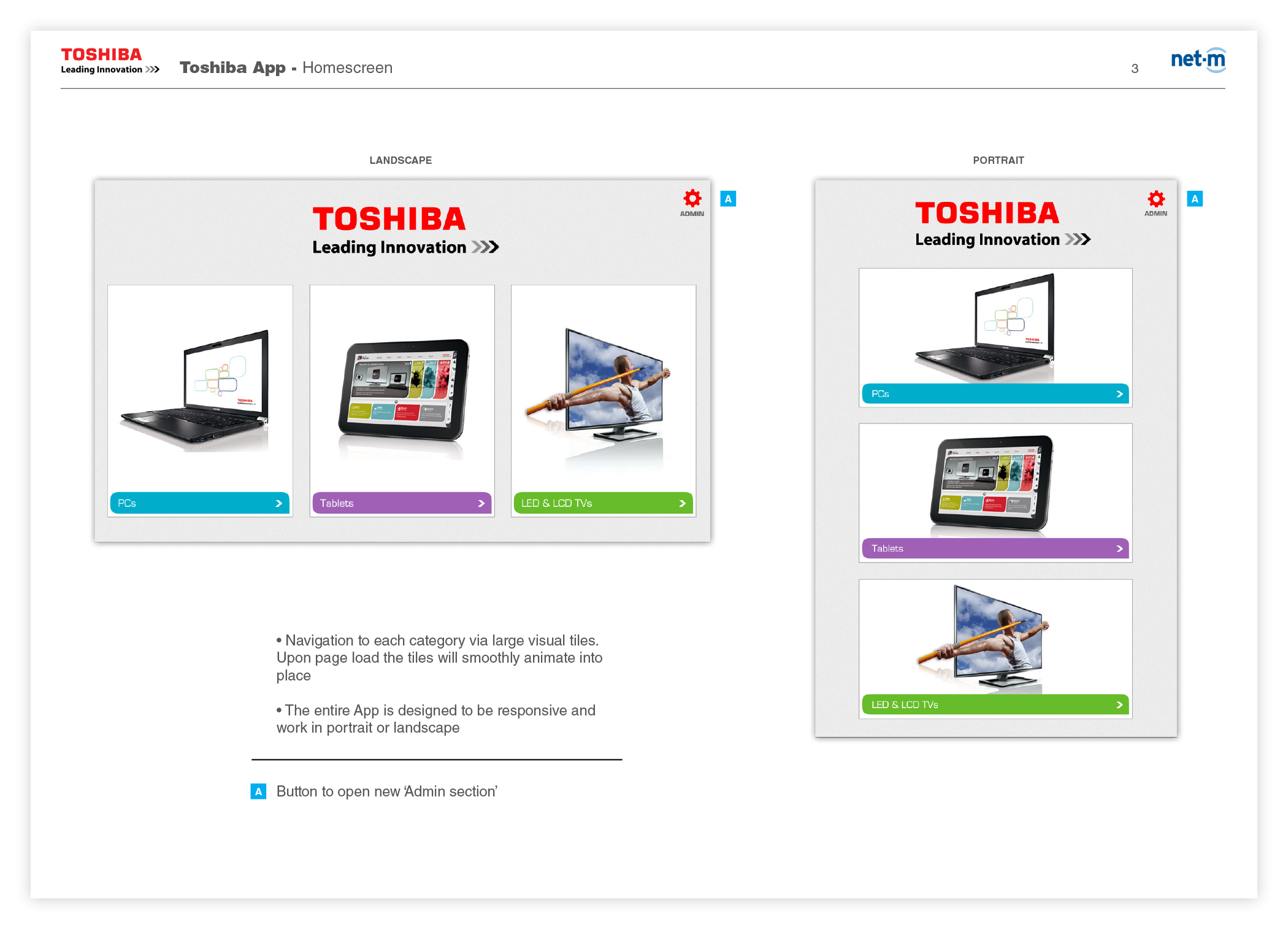
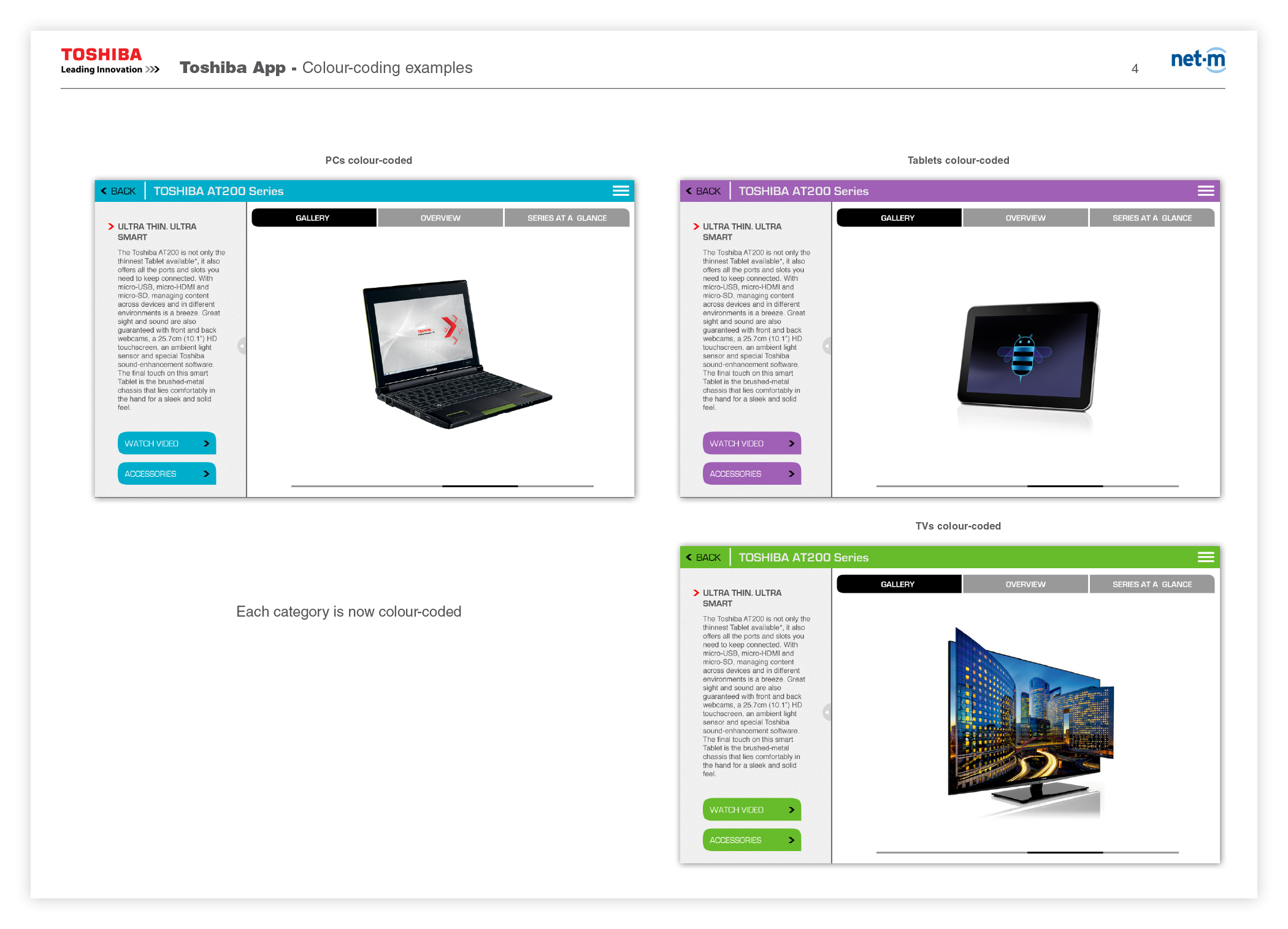
Above: the home screen of the app. The three product lines (PCs, tablets and TVs) are colour-coded according to the Toshiba brand guidelines.
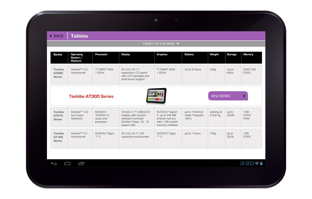
Product details screen showing technical specifications.
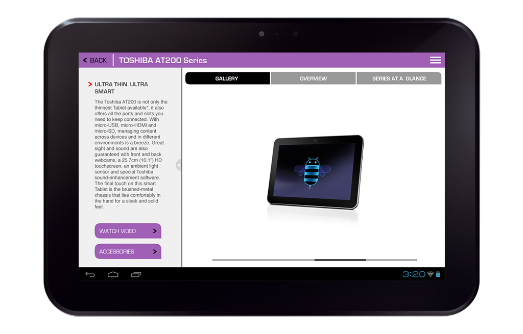
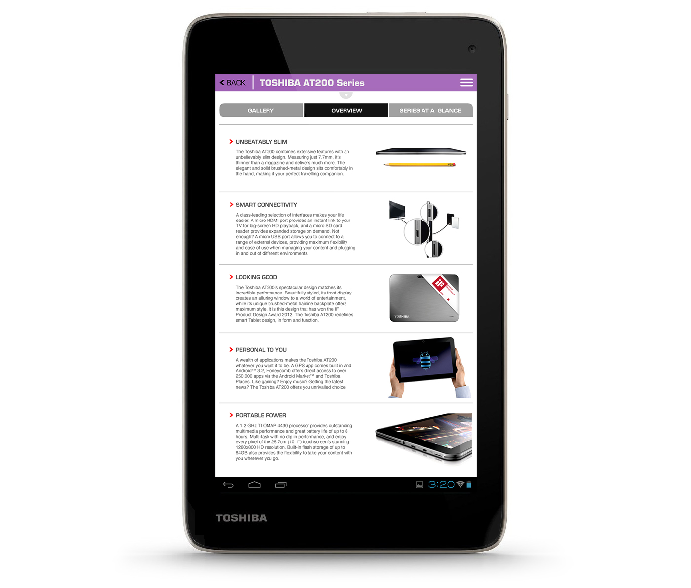
Product detail screen: three main tabs display images, highlights and technical specifications. The left hand column contains a product description, and further links to video content and a 360° view.
Product detail screen in landscape and portrait mode.
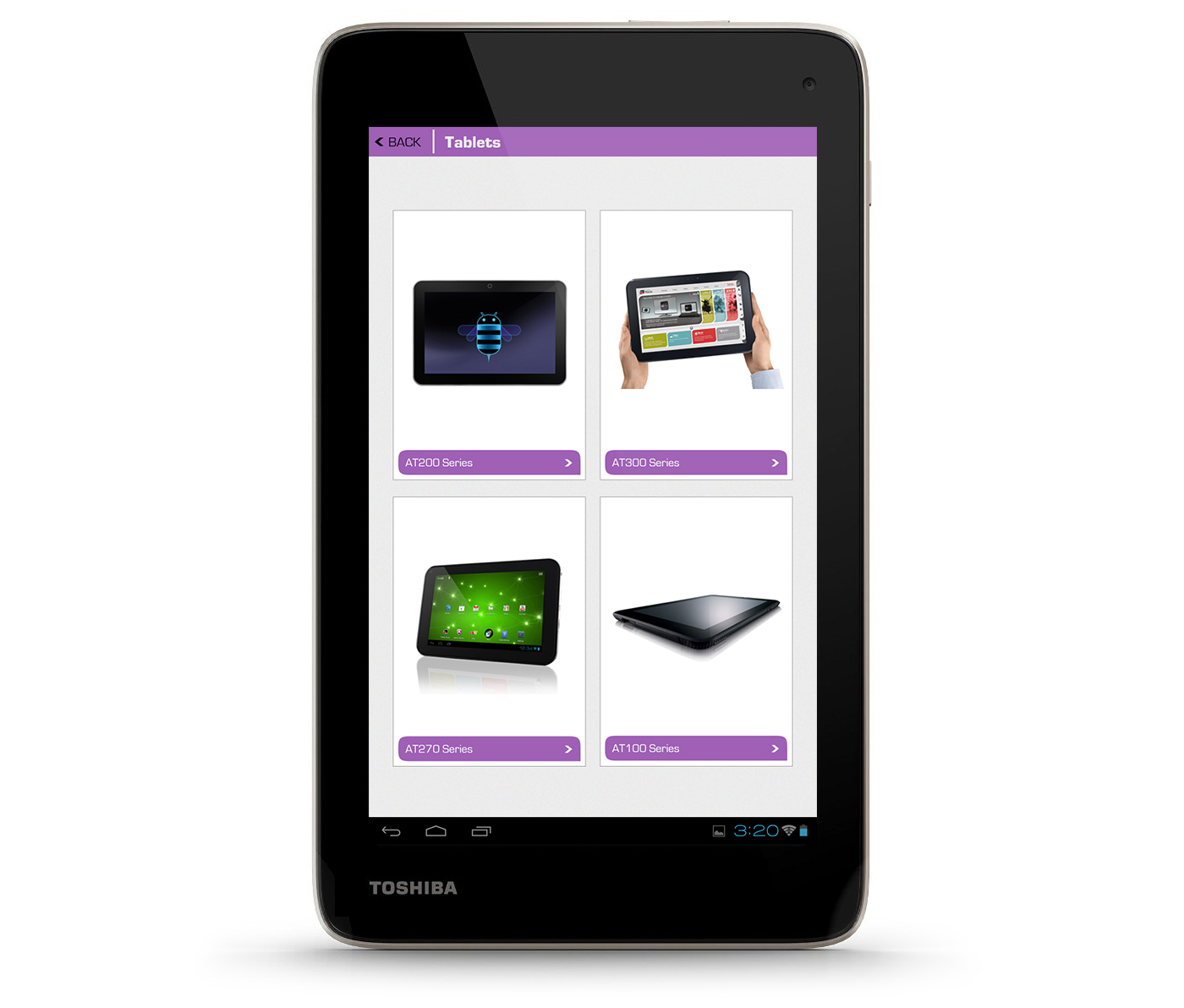
Product range menu screens: the product menu screens are also colour-coded for each product range.
Users can collapse and expand the left-hand column to give them more screen space to display the content. They can also access a quick menu via the menu icon in the top-right corner. This opens a list of all the other products within that product range.
Site map for the Toshiba app
Some of the screens from the wireframes I designed for the app.
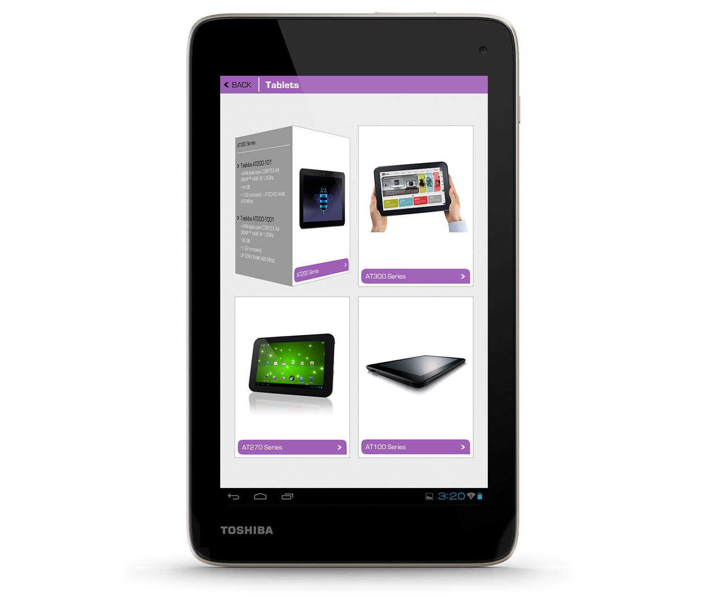
Swiping a product tile sideways flips it around to reveal further technical information.
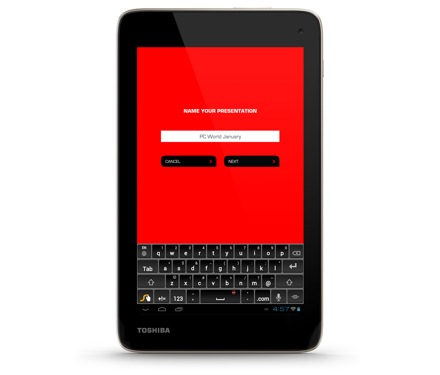
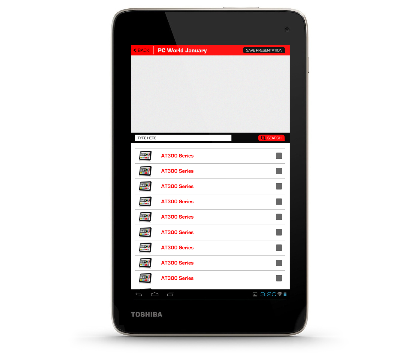
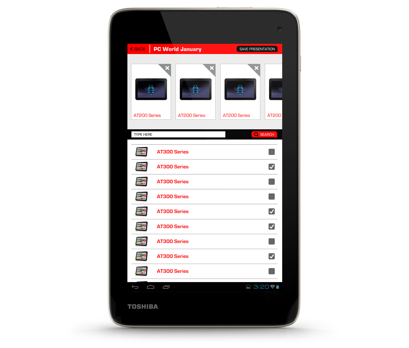
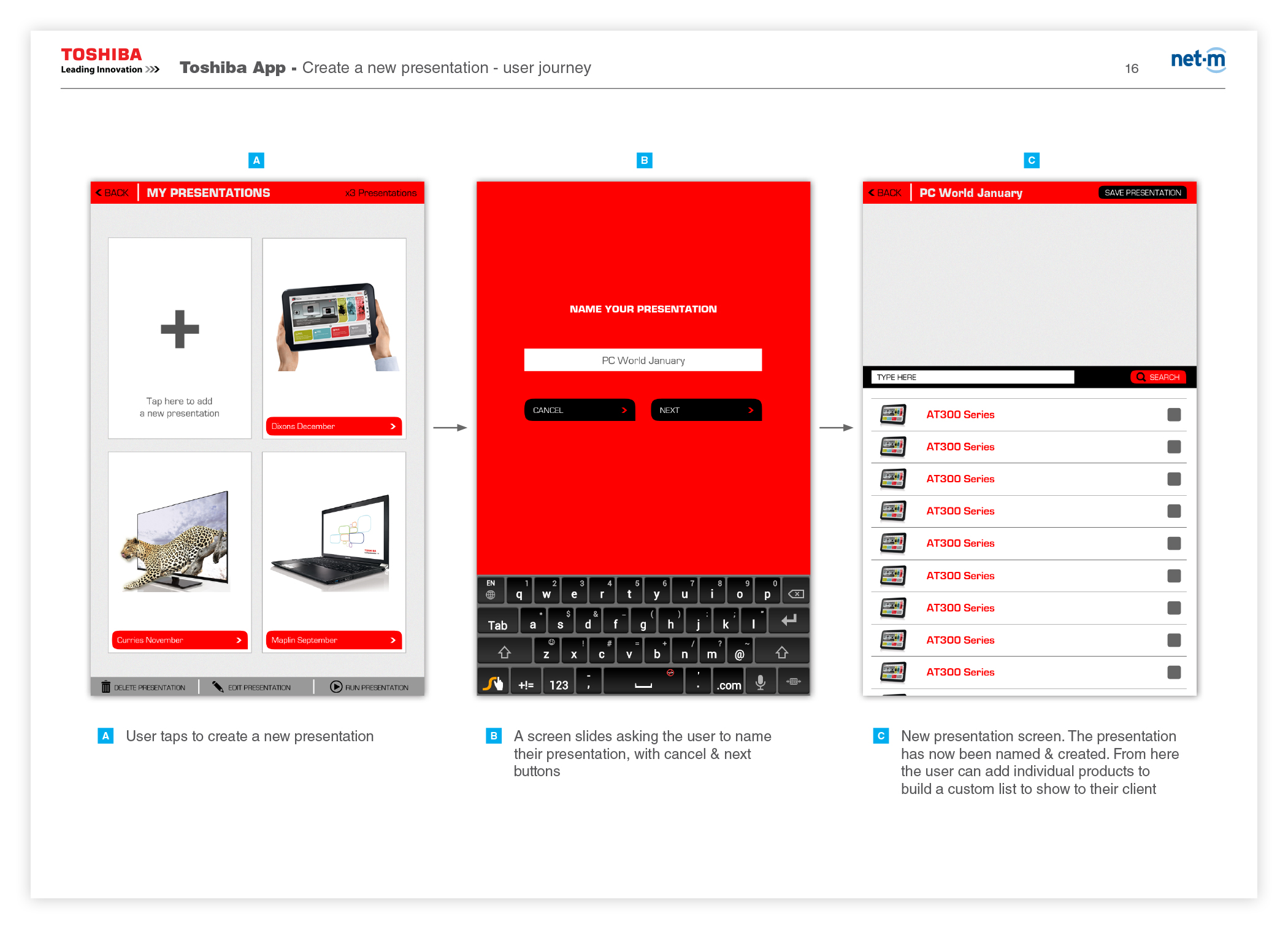
Customised presentations: the app gives the sales team the ability to create customised presentations for specific clients. They are able to filter out the products they do not wish to show, which means during meetings they can more quickly navigate between relevant products.
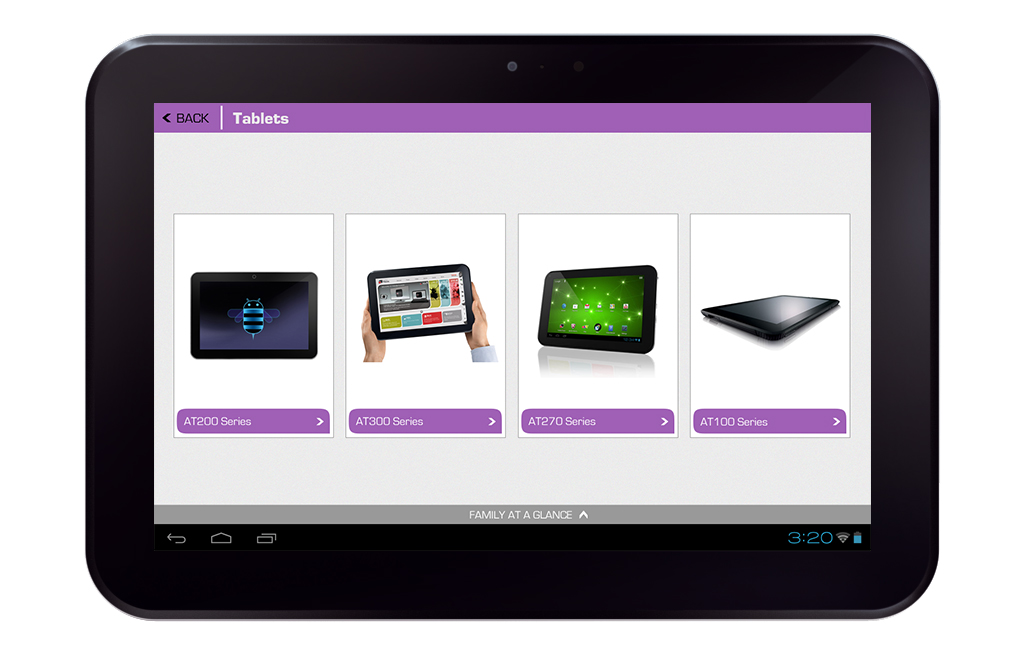
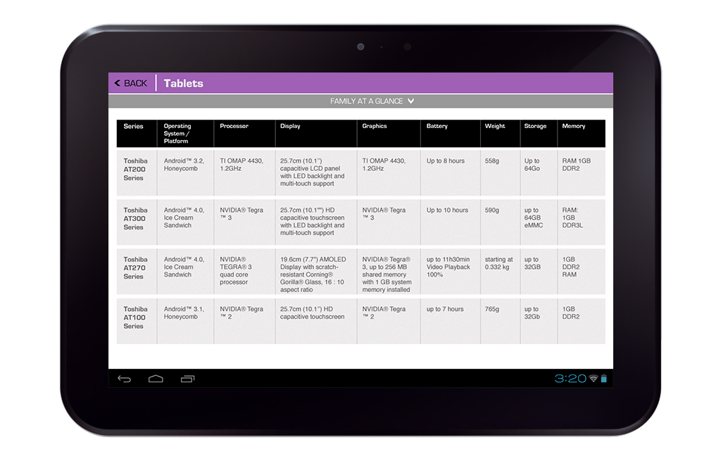
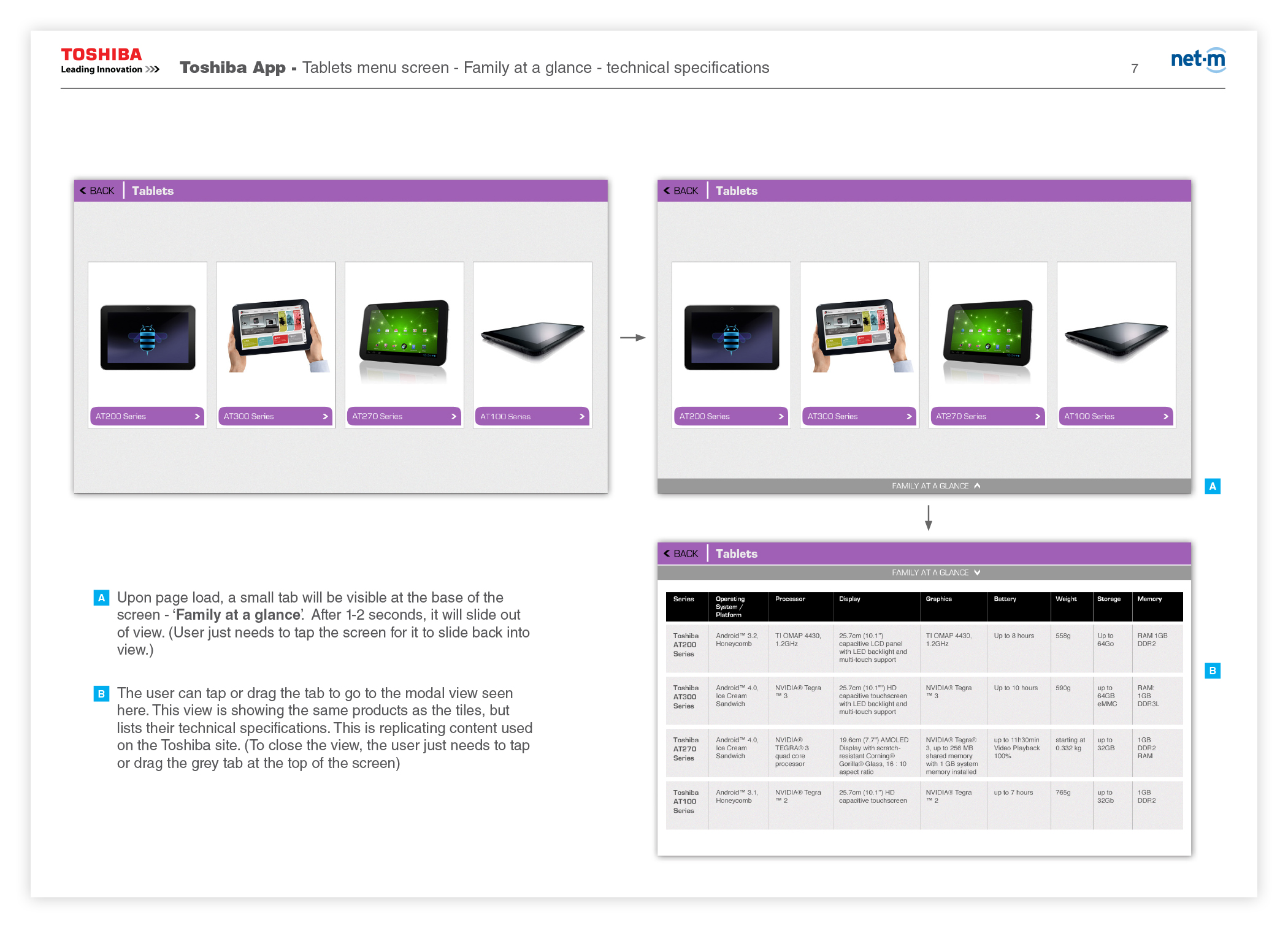
Family at a glance: from the product menu screens, there is a tab which slides up to display technical specs for all of the products within that range. This allows staff to quickly compare products alongside one another. Swiping a tile to the side flips it around to reveal an image and button to find out more.
Here are some of the screens from the client presentation for the app.
Flexible viewing options: in portrait mode the top panel can be expanded or collapsed to give the user more screen space to display the content.
Want to work with me?
If you like this project, then say hello and let’s see what I can do to help you.


