- CASE STUDY -
Bunnings self-service checkout
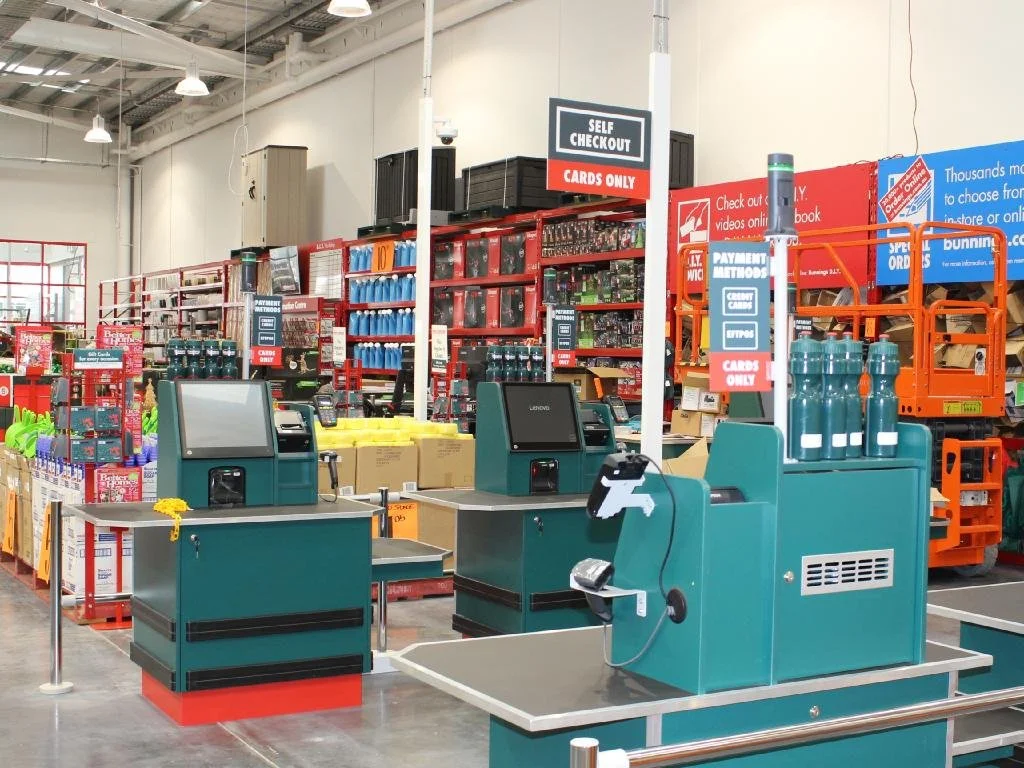
I completely redesigned the self-service checkout for Australia’s largest hardware retail outlet Bunnings Warehouse.
Client: Bunnings Warehouse (Australia).
Designed at Bunnings (in-house role), Perth, 2019-20.
About the project
The Bunnings self-service checkout is widely used across Australia and New Zealand, but was well overdue for a redesign by 2019. As part of the process the business wanted to introduce some new functionality, but the primary reason was to improve the usability and aesthetics of the product. Additionally, the old product was not responsive, so Bunnings were limited to using the same screen size/types.
Before & after
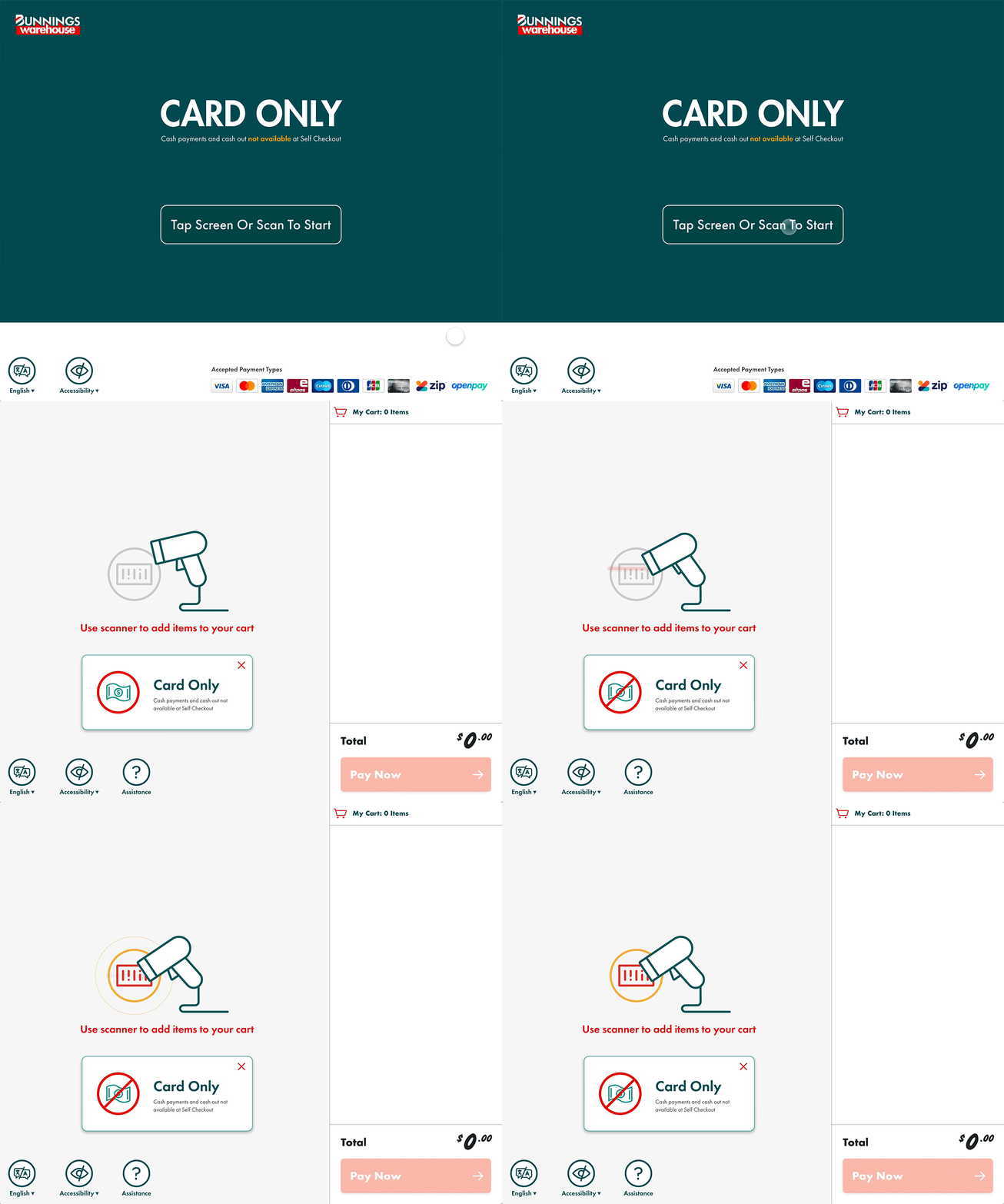
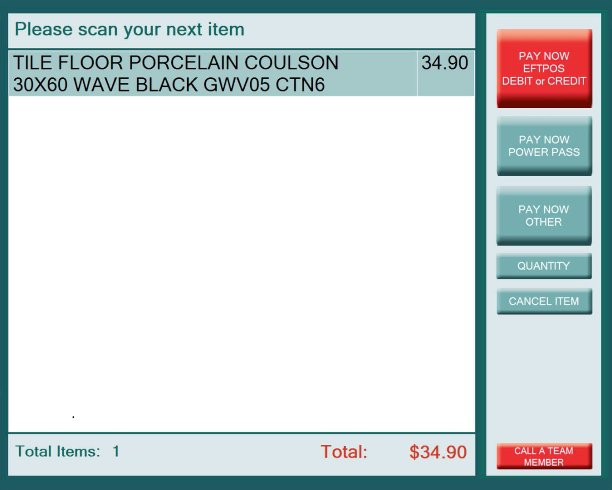
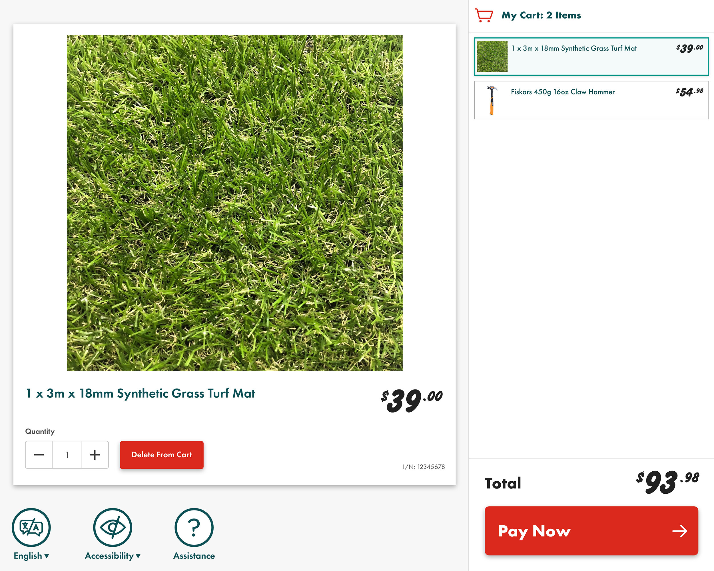
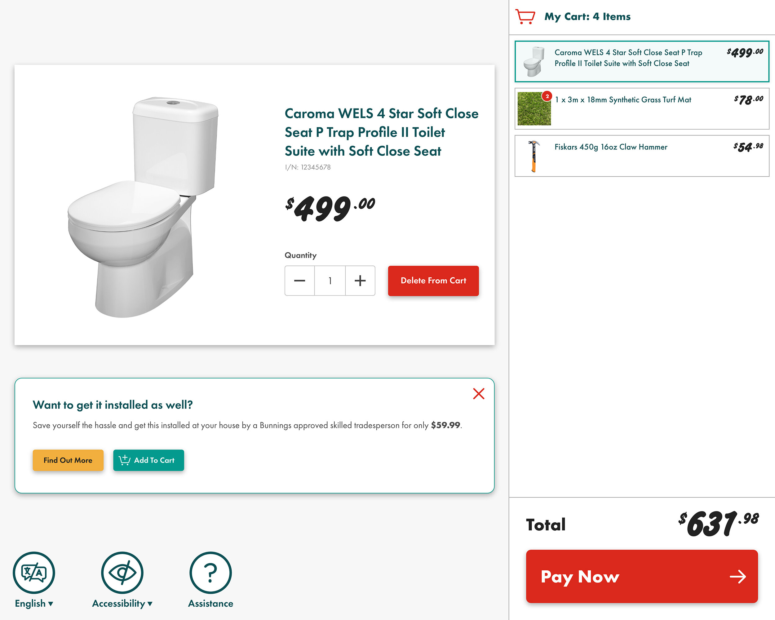
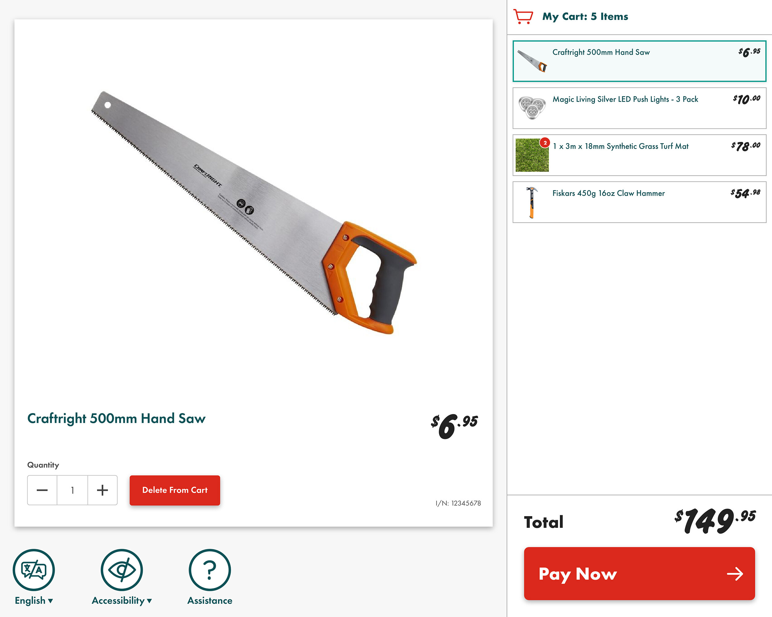
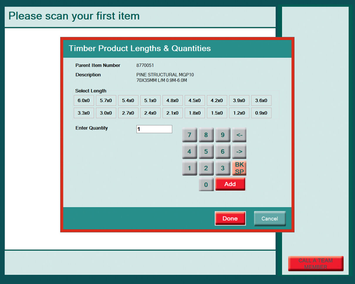
Use the slider to drag left-to-right across the image above. Dragging the slider completely to the right will reveal my new design. Dragging the slider to the left will reveal the old version. The new design is drastically different, utilising prominent product imagery with a much cleaner interface. The multiple payment buttons have been ditched to allow for a single Pay Now button which frees up space to display the items in the cart on the right of screen. The entire look of the interface has been modernised, and brought inline with Bunnings design guidelines.
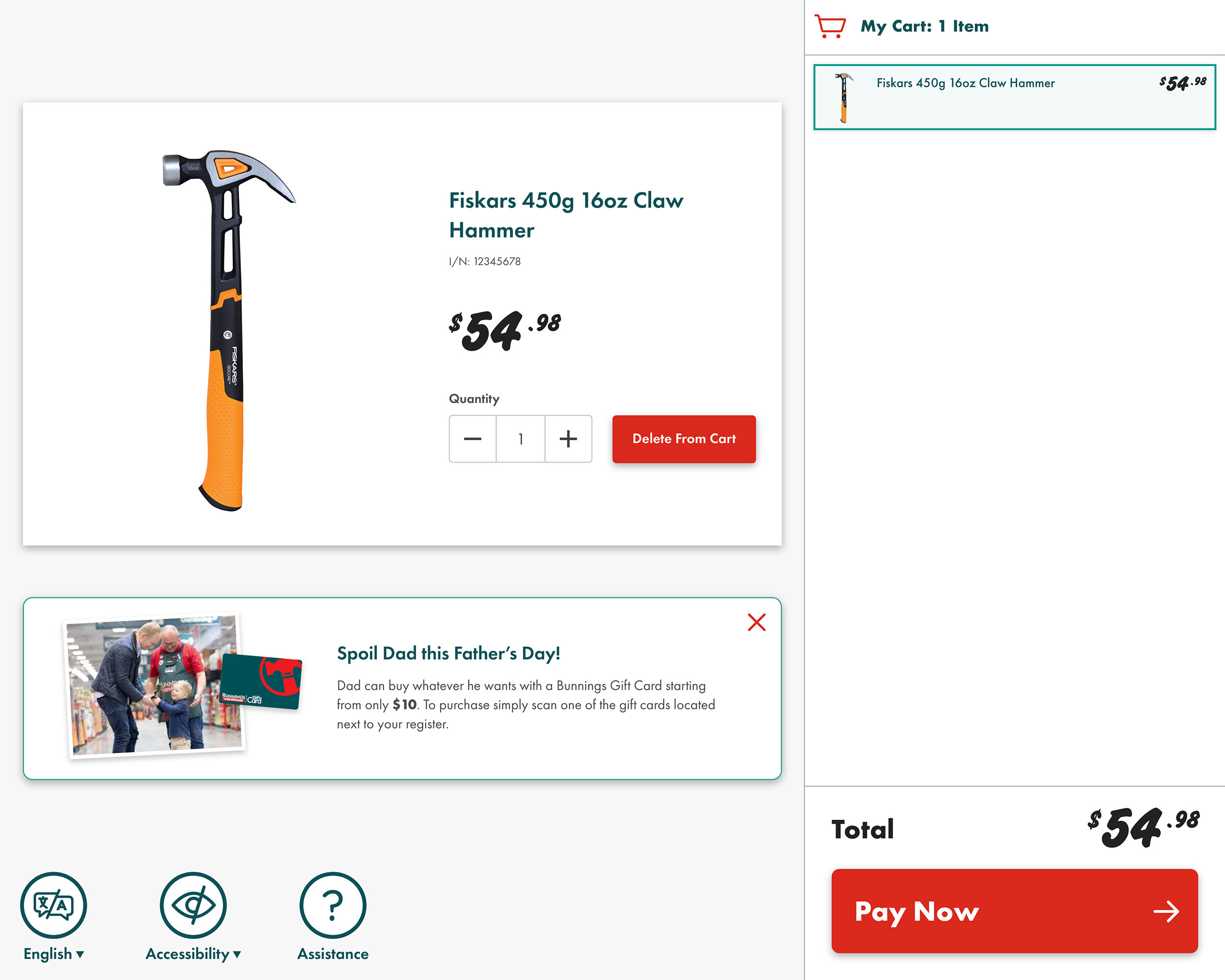
Up-selling opportunities: One of the key parts of the brief was to allow for marketing and upselling opportunities. When there are no linked upsell promotions then the product tile takes up almost the whole screen. But it's flexible enough to be able to add in secondary tiles to upsell things like service/installation, and father's day gift cards.

My role
I was the sole designer for this project, working closely with a core team of the project lead and front and back-end developers. We consulted closely with other staff throughout the business from areas such as loss prevention, testing, business analysis and store support. As part of the project I periodically showcased the clickable prototypes to key business stakeholders to get feedback on the direction we were taking.
Research, research, research
Before the project kicked off I conducted extensive research into self-service checkouts. I read papers about their effectiveness, and looked at design patterns and styles from examples from around the world. I then hit the ground, visiting every other retailer in Perth to use their units including Target, Coles, Woolworths, Big W and McDonalds.
We then blocked off a full day to run a workshop with myself, the information architect, project lead and three developers. We looked at the redesign as a chance to start with a clean slate. We discussed the known issues and limitations of the existing product, new feature requests from the business, the pros and cons of competitor’s products, technical approaches and how to structure the user flow.
After our initial workshop the project lead and I spent some time in Bunnings stores observing customers making transactions, as well as speaking to the Bunnings staff in-store who assist customers using the units. I also talked to people I knew who used the service regularly to gauge their opinions.
This research was invaluable for the design process. We identified a number of additional user pain-points which our team was not aware of. But the big surprise was that the existing units are actually much easier to use than the competitors! This is primarily because the Bunnings units do not weigh products like supermarkets or retailers (it’s hard to weigh a 200kg BBQ!) “Incorrect item in the bagging area” is never a problem with the Bunnings product - which is a big advantage from a user experience point of view.
Animation
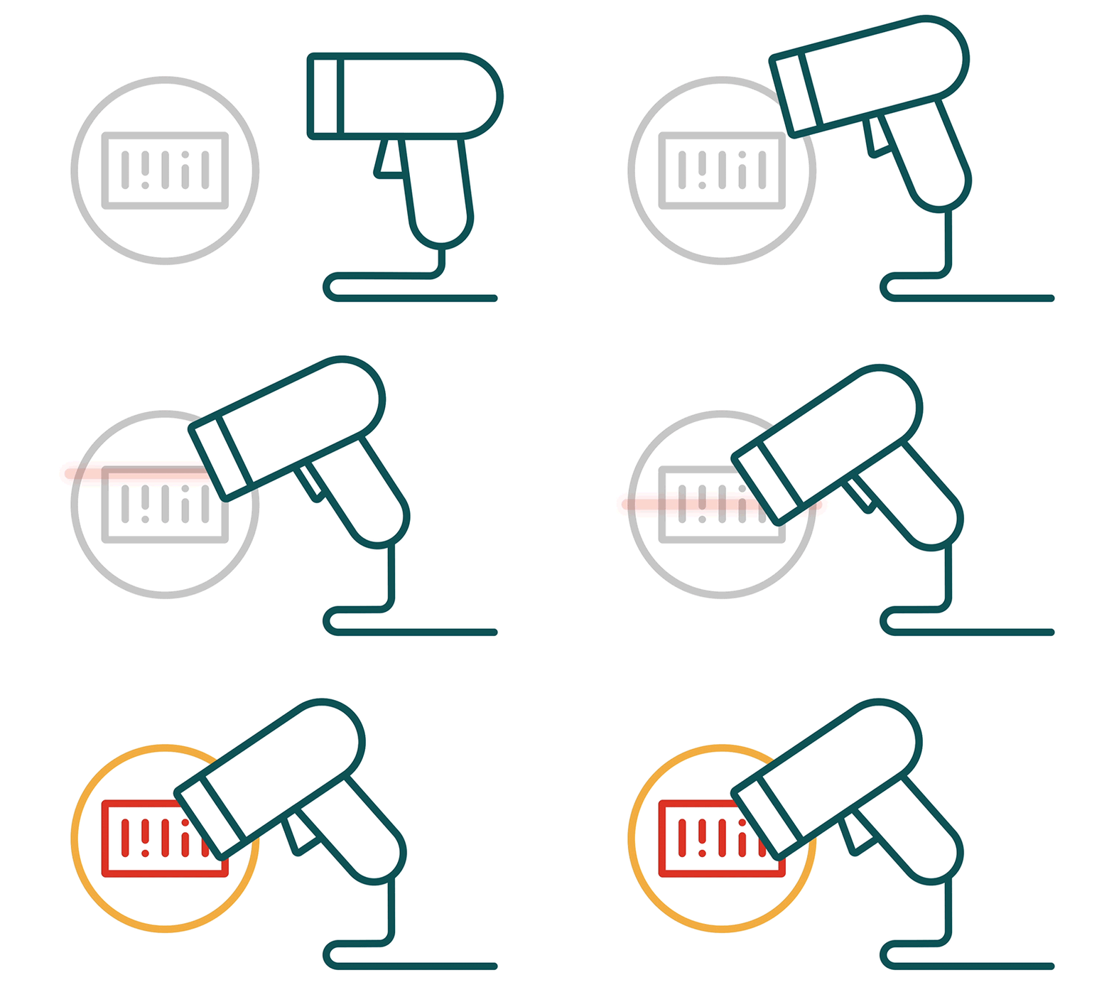
The business had requested early on that we use animations to help illustrate some of the key interactions during the user flow – in particular at the point of payment. I created a series of animations first in Adobe XD as prototypes, then refined them further in Adobe After Effects. I exported these as .json code and we incorporated them into the product using the excellent Lottie animation library. In the video below you can see some of these animations in use during the payment process.
Payment process: See the flow for payments via eftpos, PowerPass (Bunnings trade card/app) and Zip. These utilise animations I created to help illustrate to the user how to complete the payments.
Before and after: Use the slider to drag left-to-right across the image above. Dragging the slider completely to the right will reveal my new design. Dragging the slider to the left will reveal the old version.
Products with multiple lengths
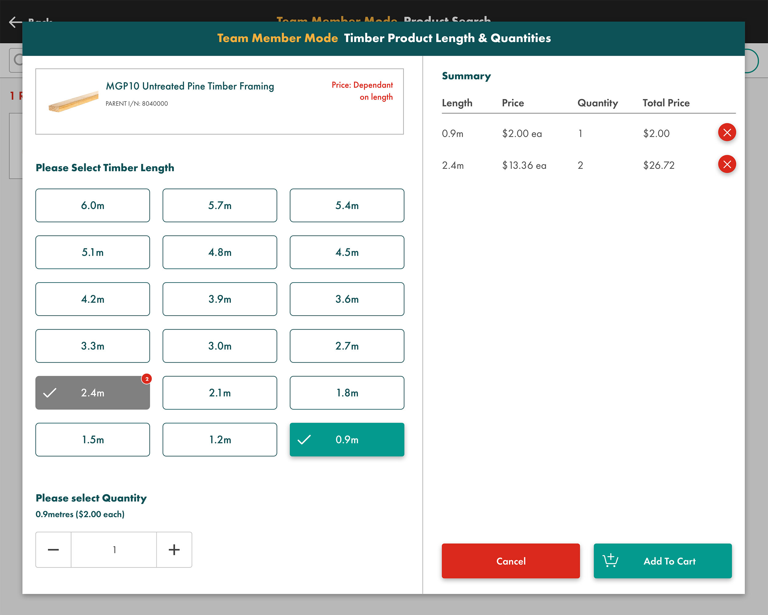
One of the challenges presented by this project was redesigning how staff add items with multiple lengths to a sale. At Bunnings there are various types of timber products that are linked under the same item number, but have multiple lengths and prices (see a before and after example of this screen above).
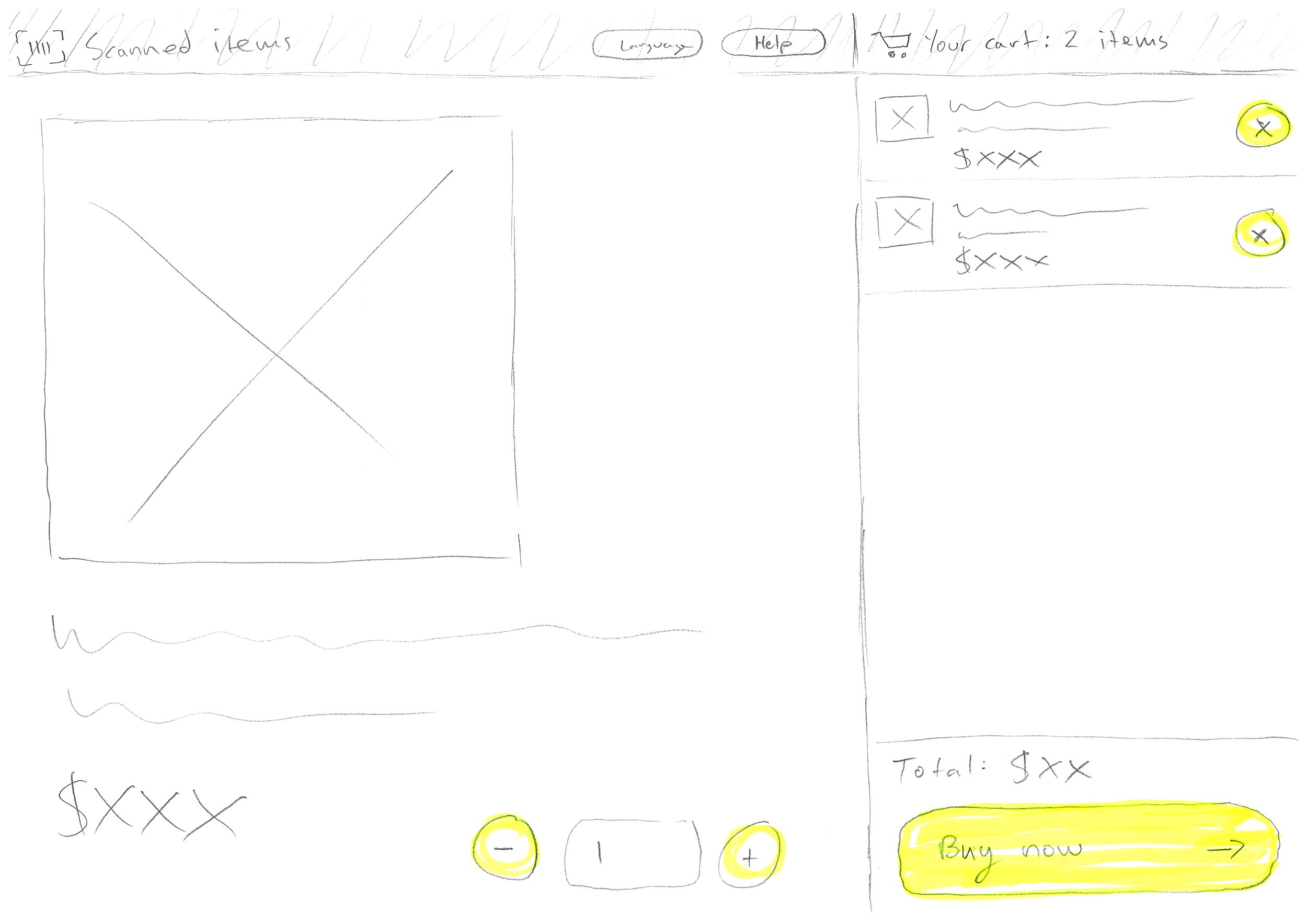
The existing version is quite unintuitive, as there is no summary to let users know which of the various products they have selected, and at what quantities. In the new design the screen is split into two, with the product description, buttons for lengths and quantity selection on the left, whilst the summary of products added to the sale with quantities and prices are displayed on the right. See the video below of this process in action where a staff member searches for a linked timber product, then adds multiple length products to the sale for the customer.
Products with multiple lengths video walkthrough
Those pesky, hard to scan items ☝️
Another challenge when transacting at Bunnings is the large number of items which aren’t easily scanned at the point of sale. Some examples are products which are too small for barcodes, or are made of a material where stickers frequently fall off, or products which are cut to size, so the price is always variable.
Bunnings has an existing solution called Shadowbooks, where staff can browse through categories of products to find the specific item they need to add to a sale, however it is quite a clunky, inconsistent experience. I completely redesigned Shadowbooks to be more user-friendly. A key part of this was designing a suite of icons to represent these categories (see the icon family above.)
In the video walkthrough below a customer calls for staff assistance. The staff member enters into Team Member Mode and then searches in Shadowbooks. They drill down through the categories (each of which is represented by an icon) until they find the product they are looking for (in this instance some rope which has been cut to size). They then need to type in the length of rope and add it to the sale.
A video walkthrough of a staff member finding some rope which has been cut to size in Shadowbooks
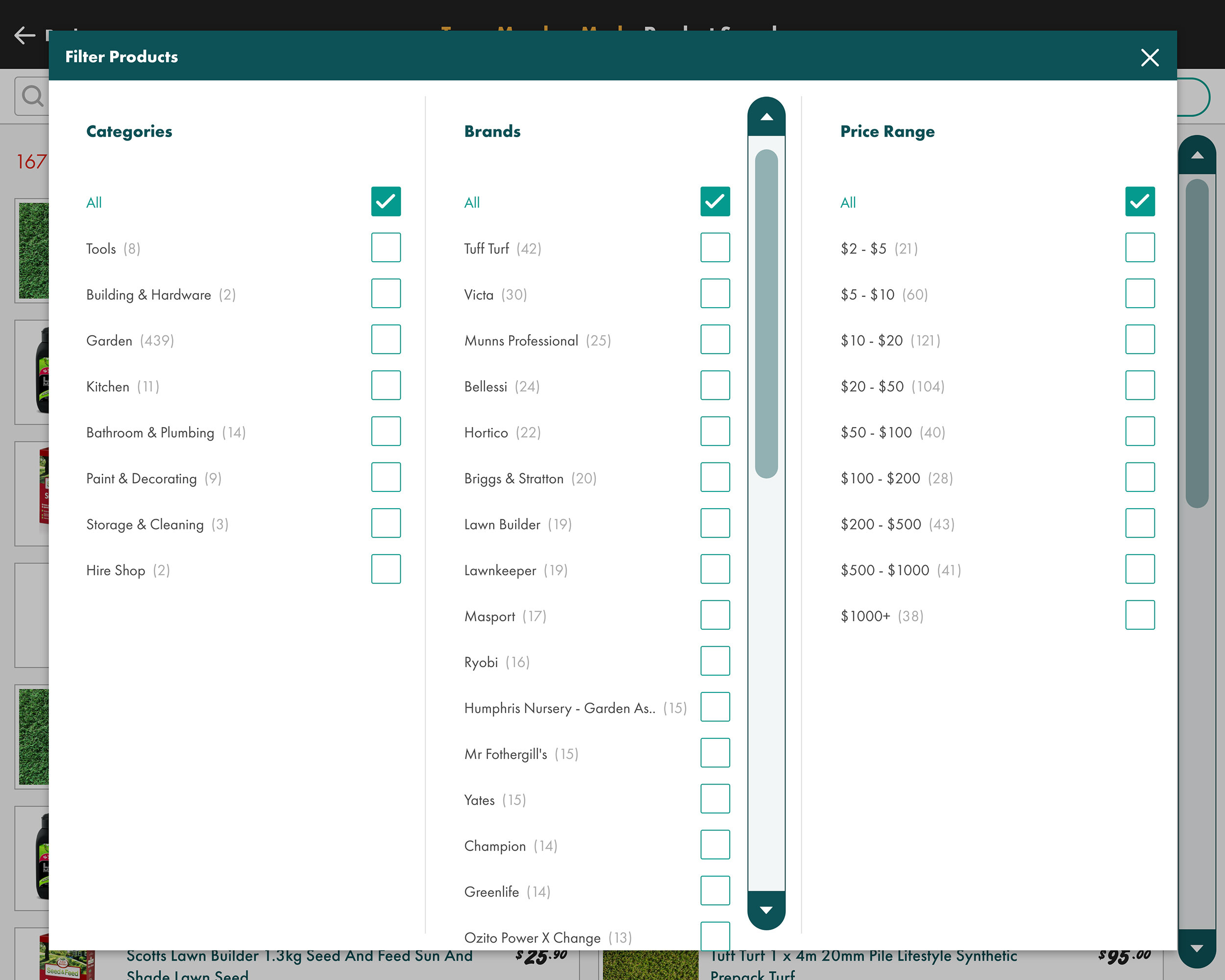
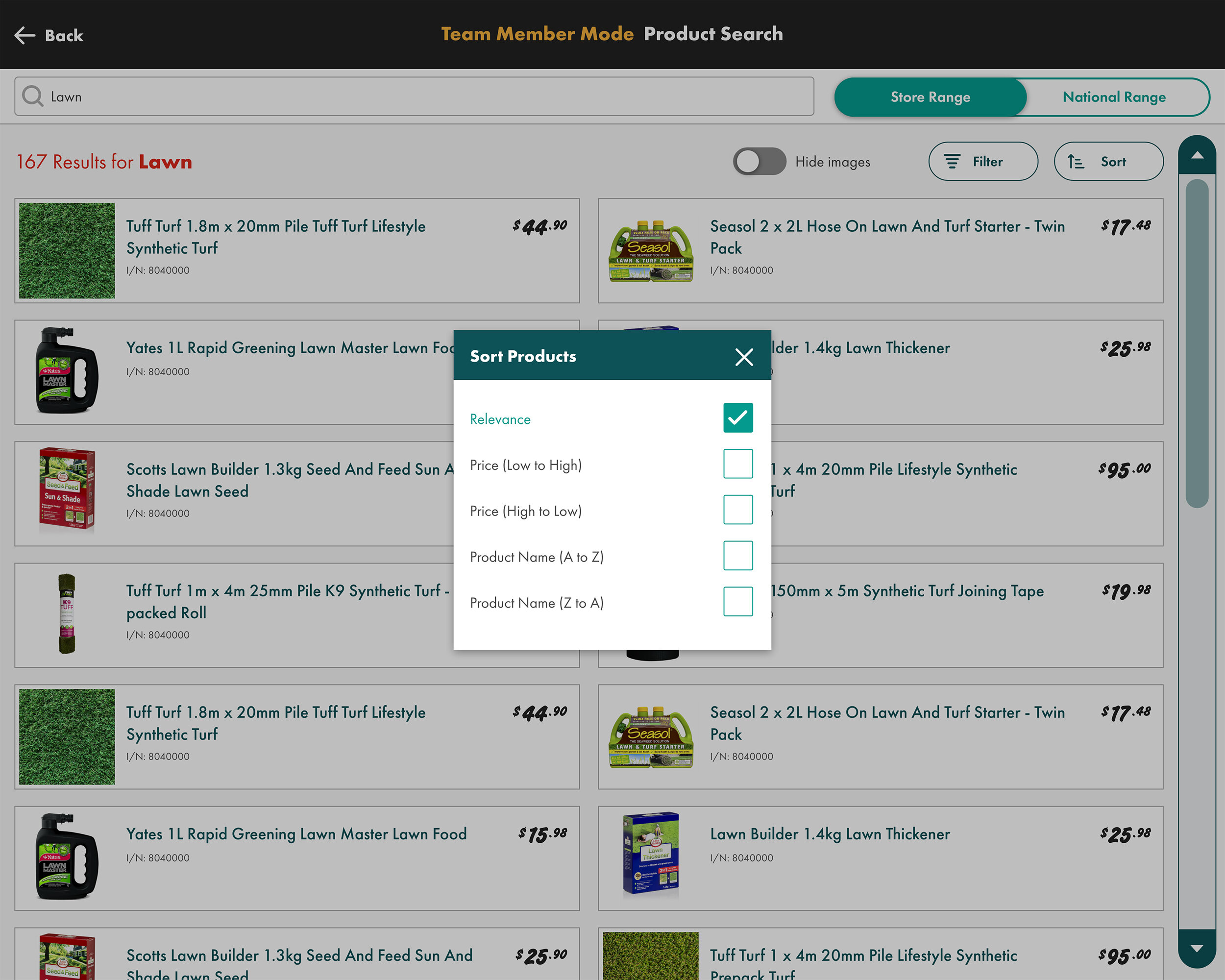
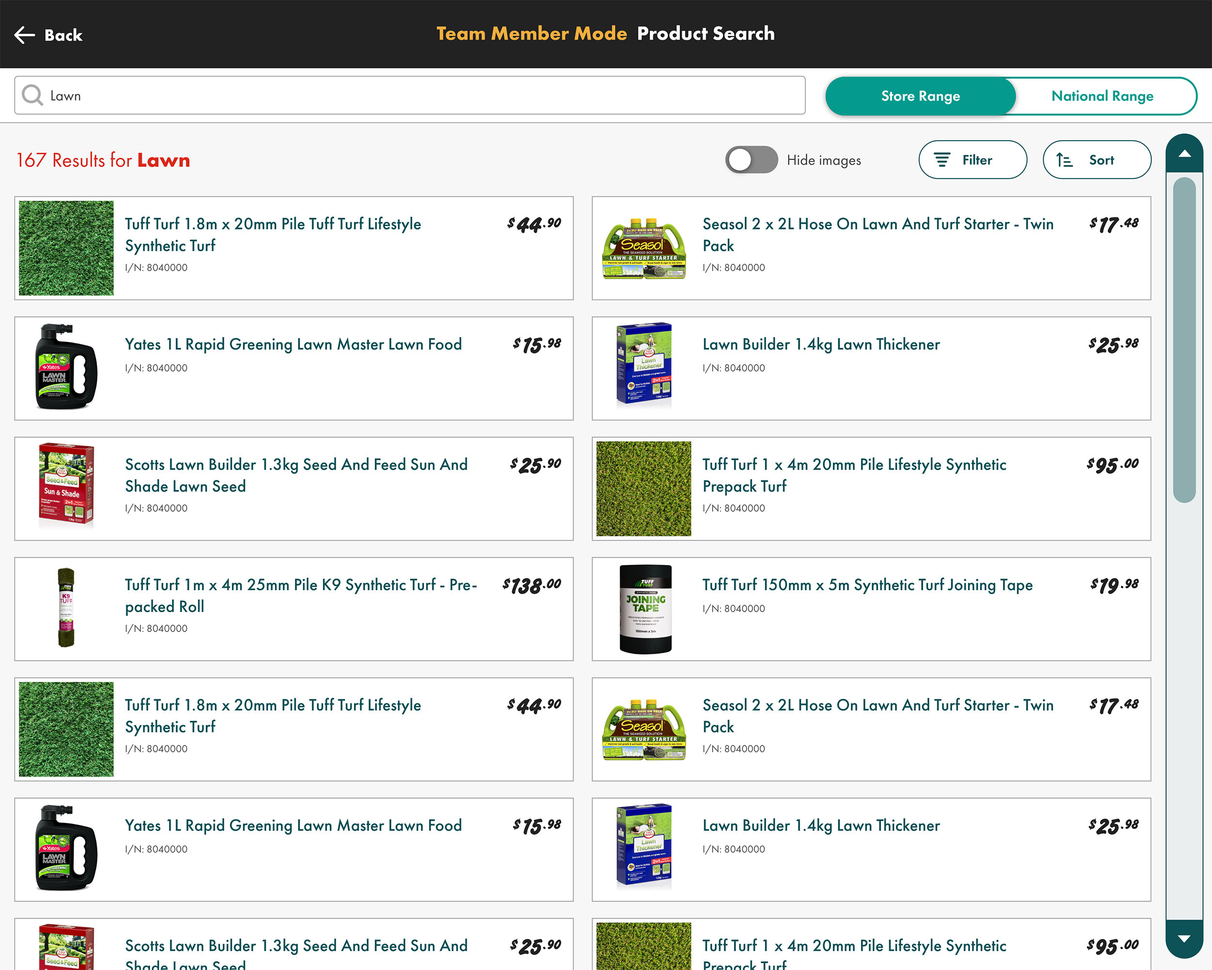
Search results screens with sorting and filtering options

Accessibility & multi-lingual support
One of the key things I pushed for in the redesign was to introduce some accessibility features. This was to be the first bilingual Bunnings product, which is important in multicultural countries like Australia and New Zealand. The high-contrast option changes the interface to increase contrast and thicken border weights. There is also the option to increase the font size. These two options are intended to assist users with poor eyesight, and/or colour-blindness (I tested the effectiveness of these with people who suffered from these conditions).
A summary button allows users to take over the whole screen with the shopping cart. This makes it easier to see all the items which have been added.

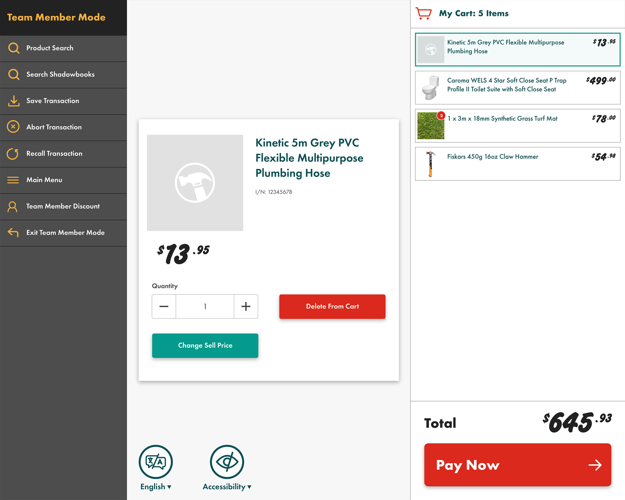
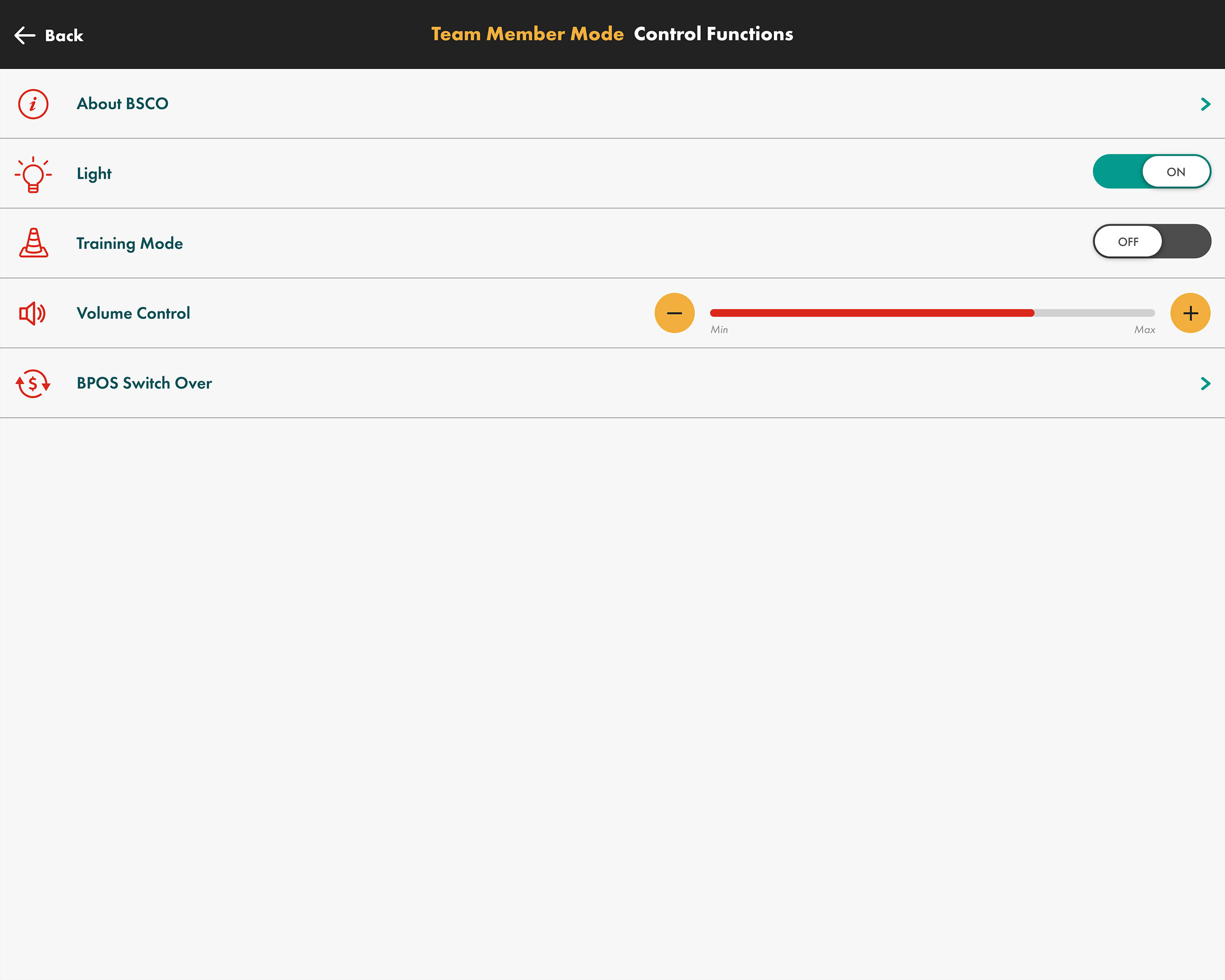
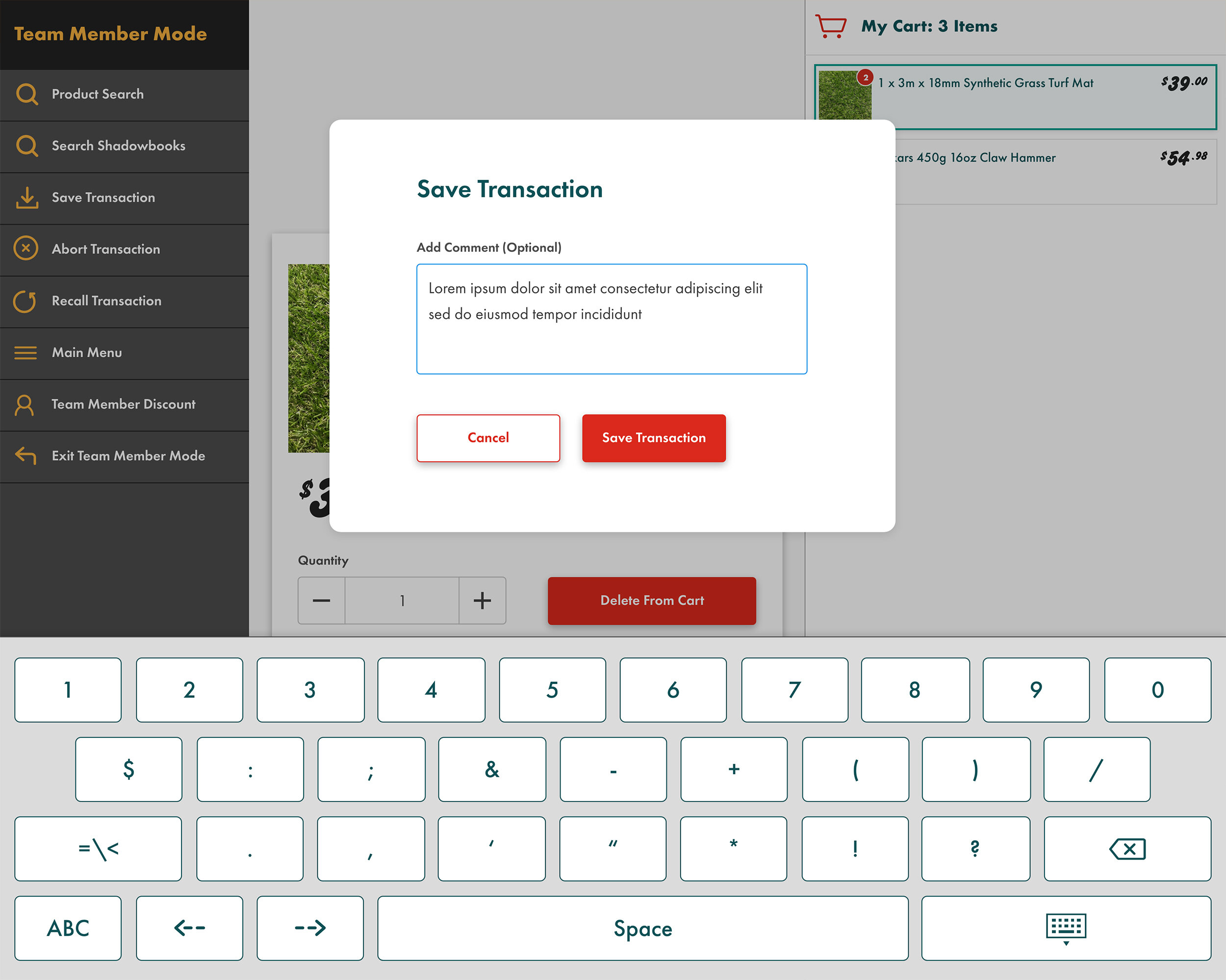
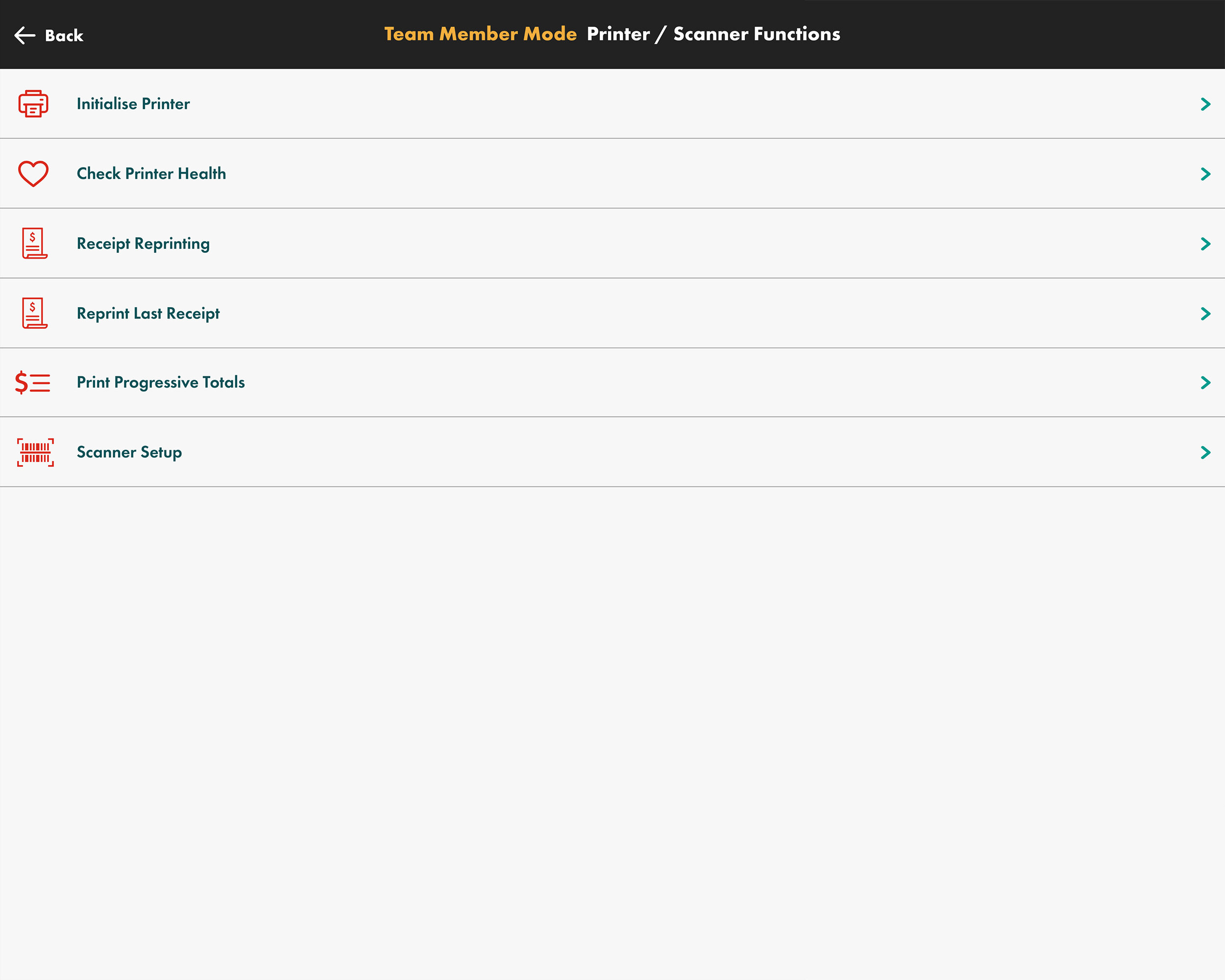
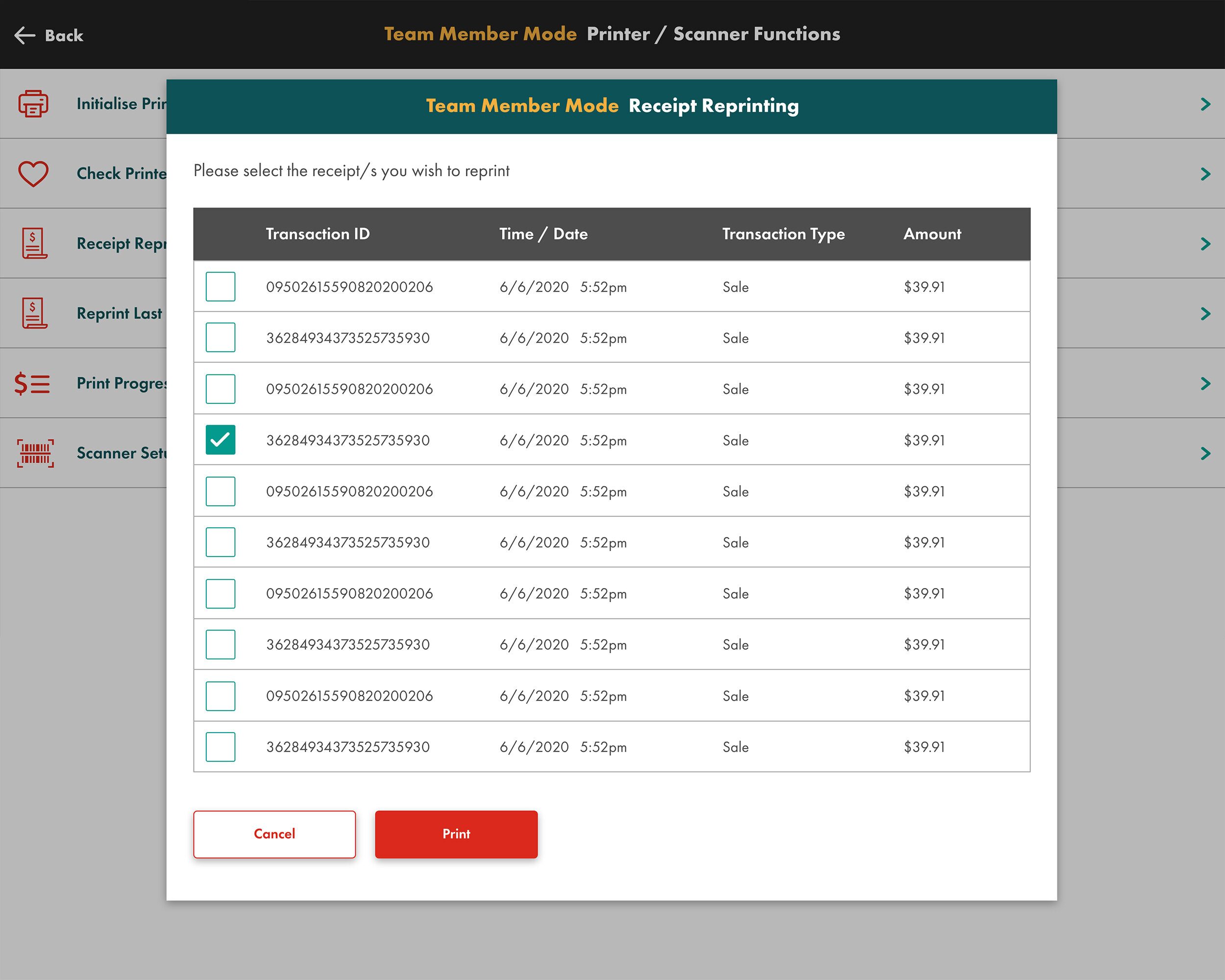
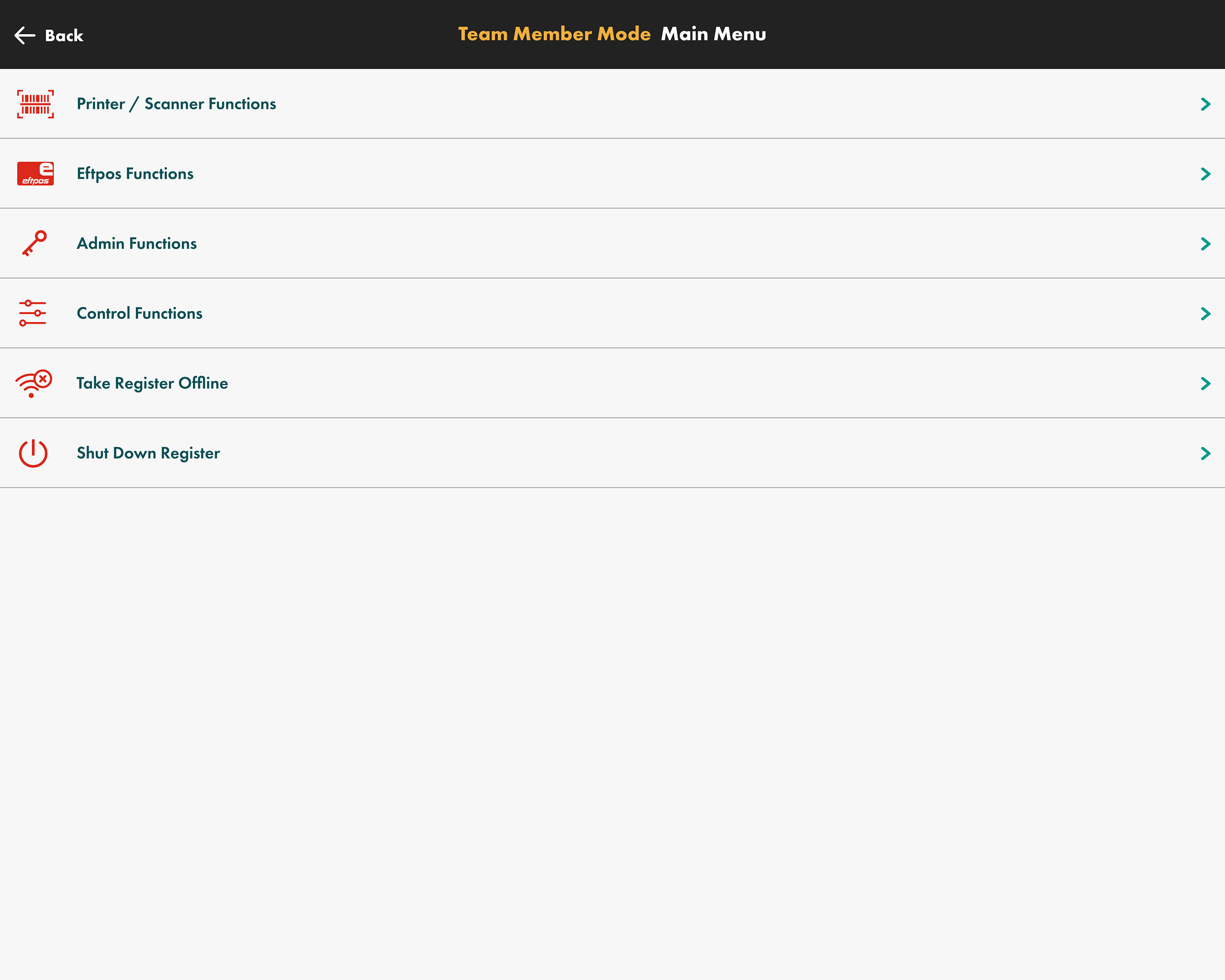
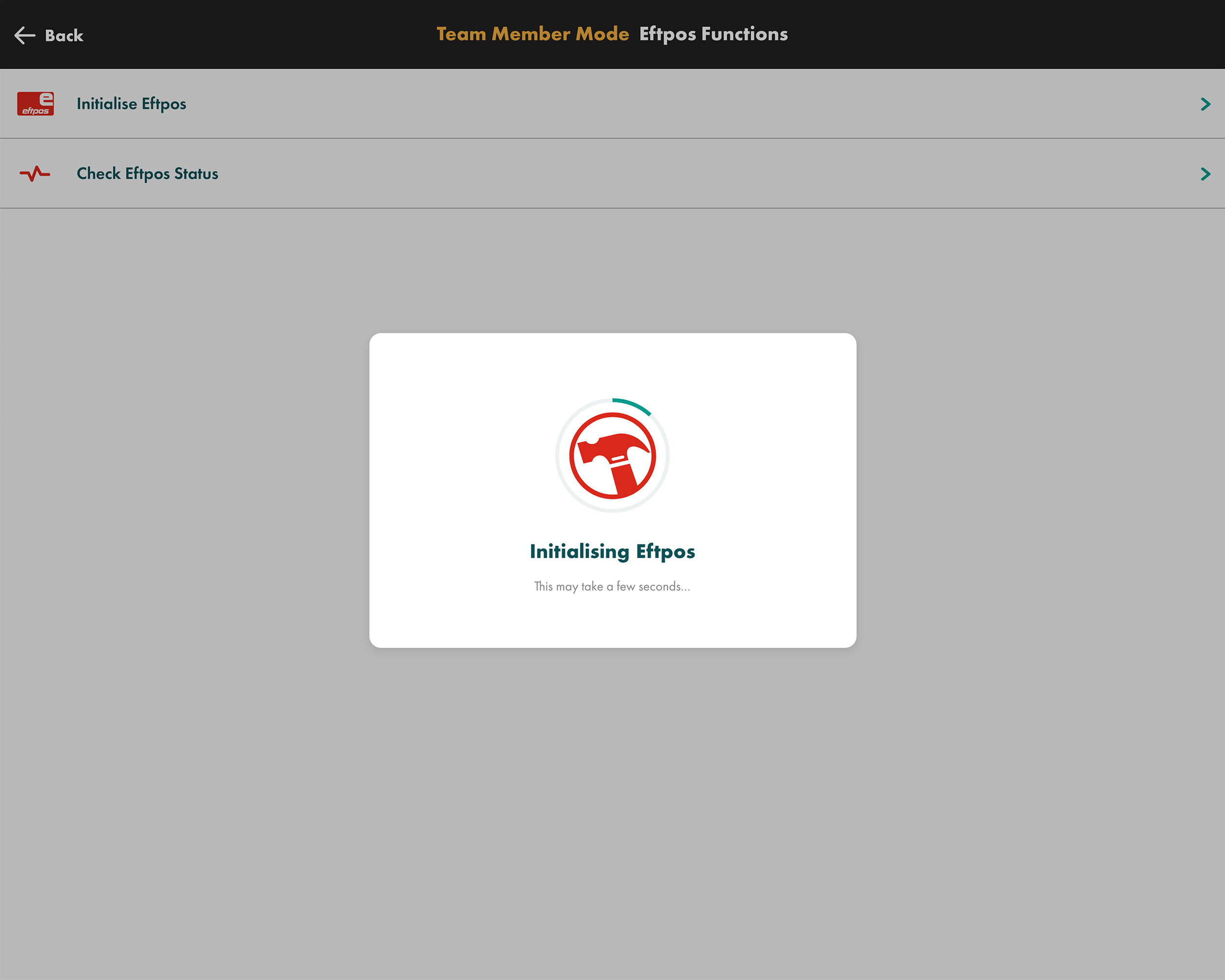
Various screens from staff-only Team Member mode
Team member mode
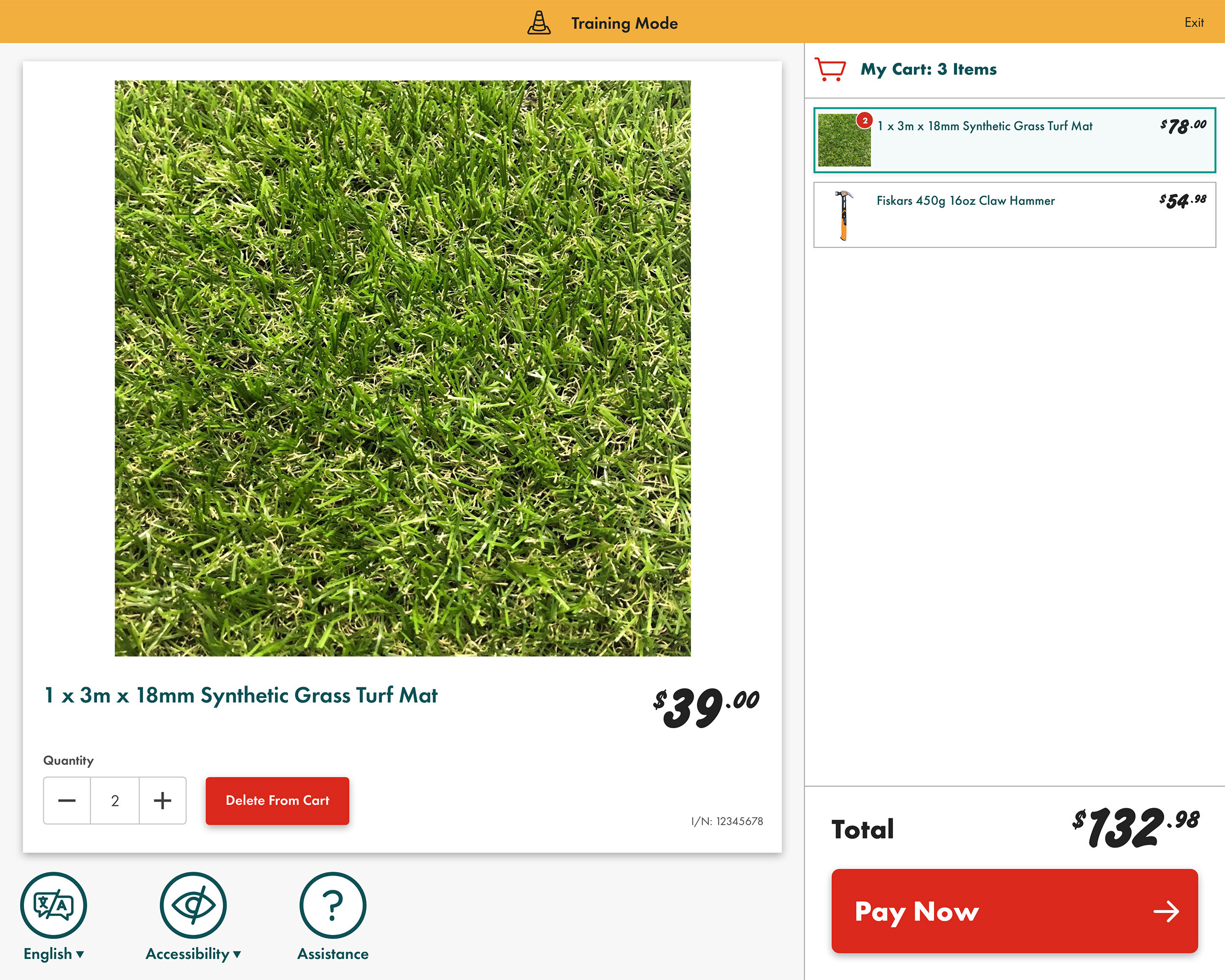
There are numerous features which are only available to staff via Team Member Mode including: recall/save transactions, product search, Shadowbooks, training mode, applying discounts, settings and various configuration options. I redesigned Team Member Mode to be accessed initially via a side menu on the left of screen, whilst additional sections are displayed in new windows. See a video below where a member of staff recalls a saved transaction for a customer.
Team member mode - recall transaction
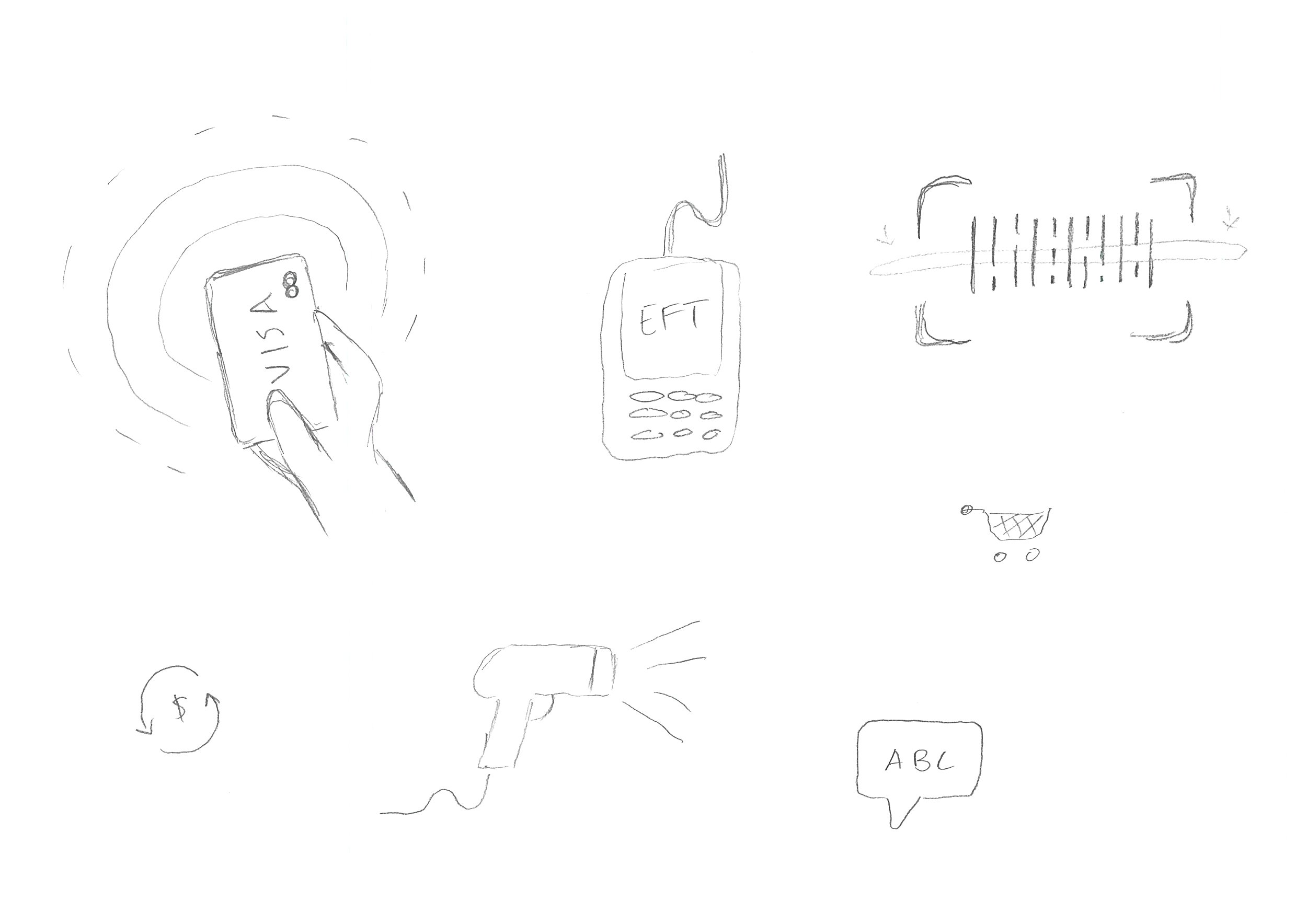
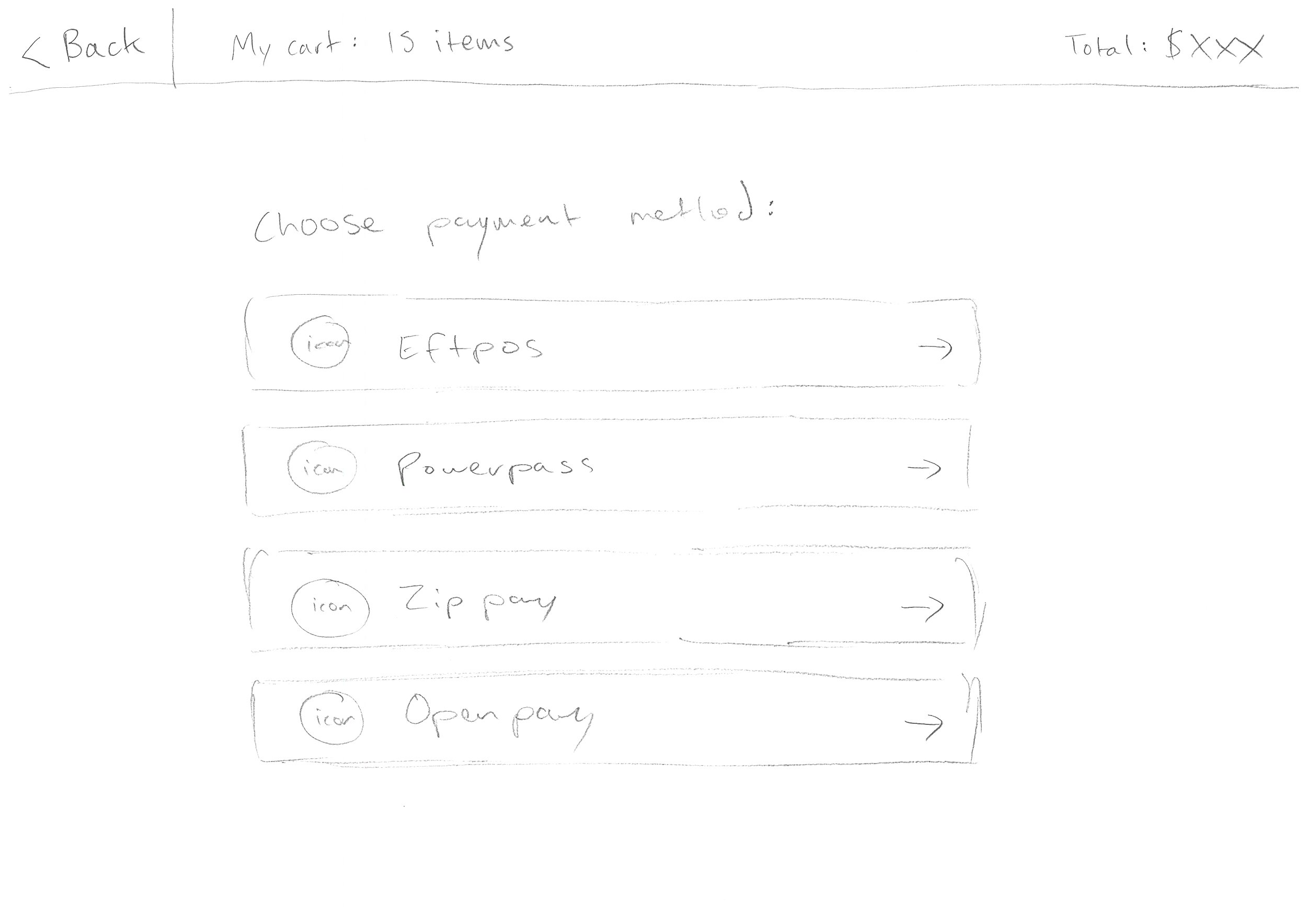
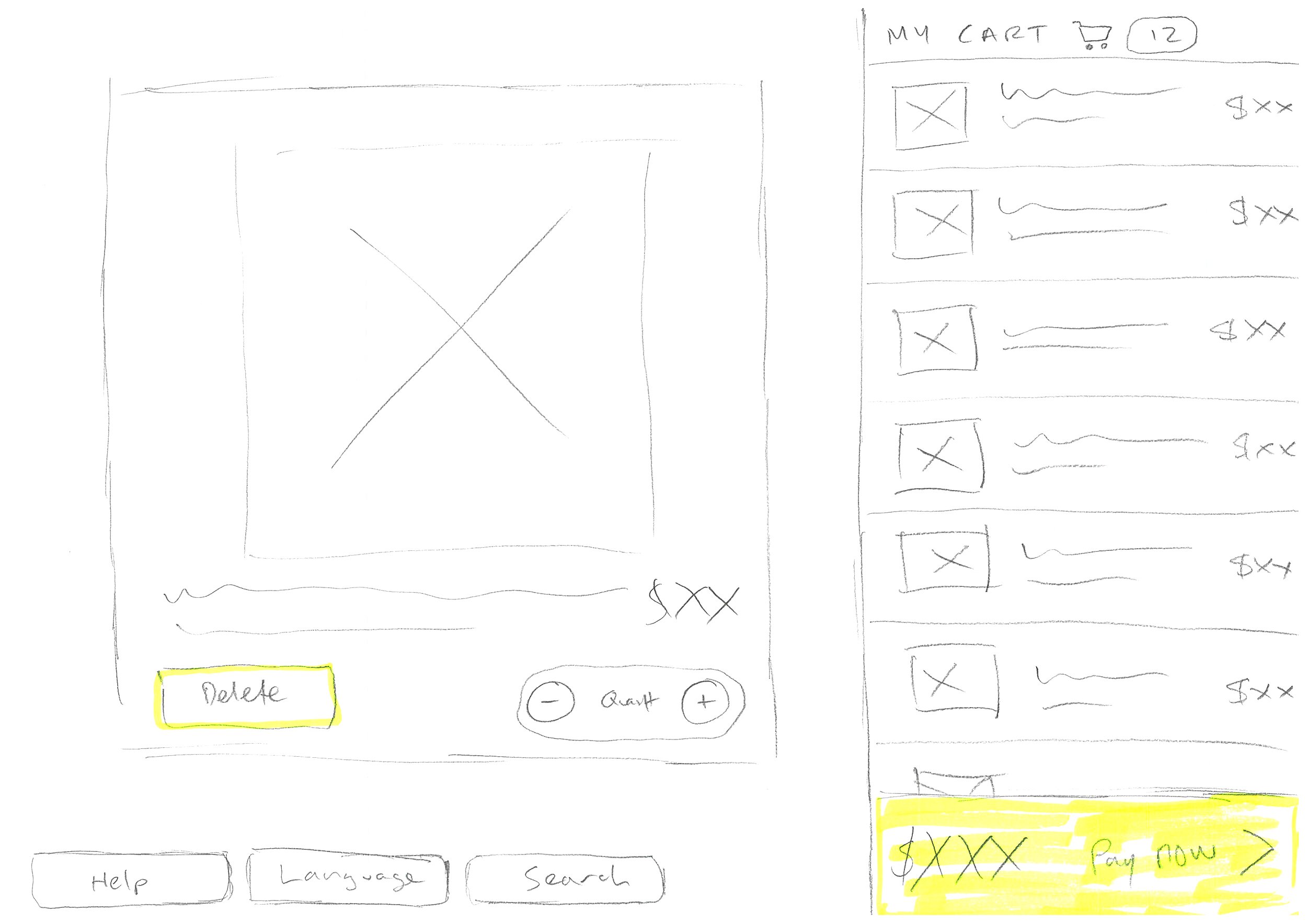
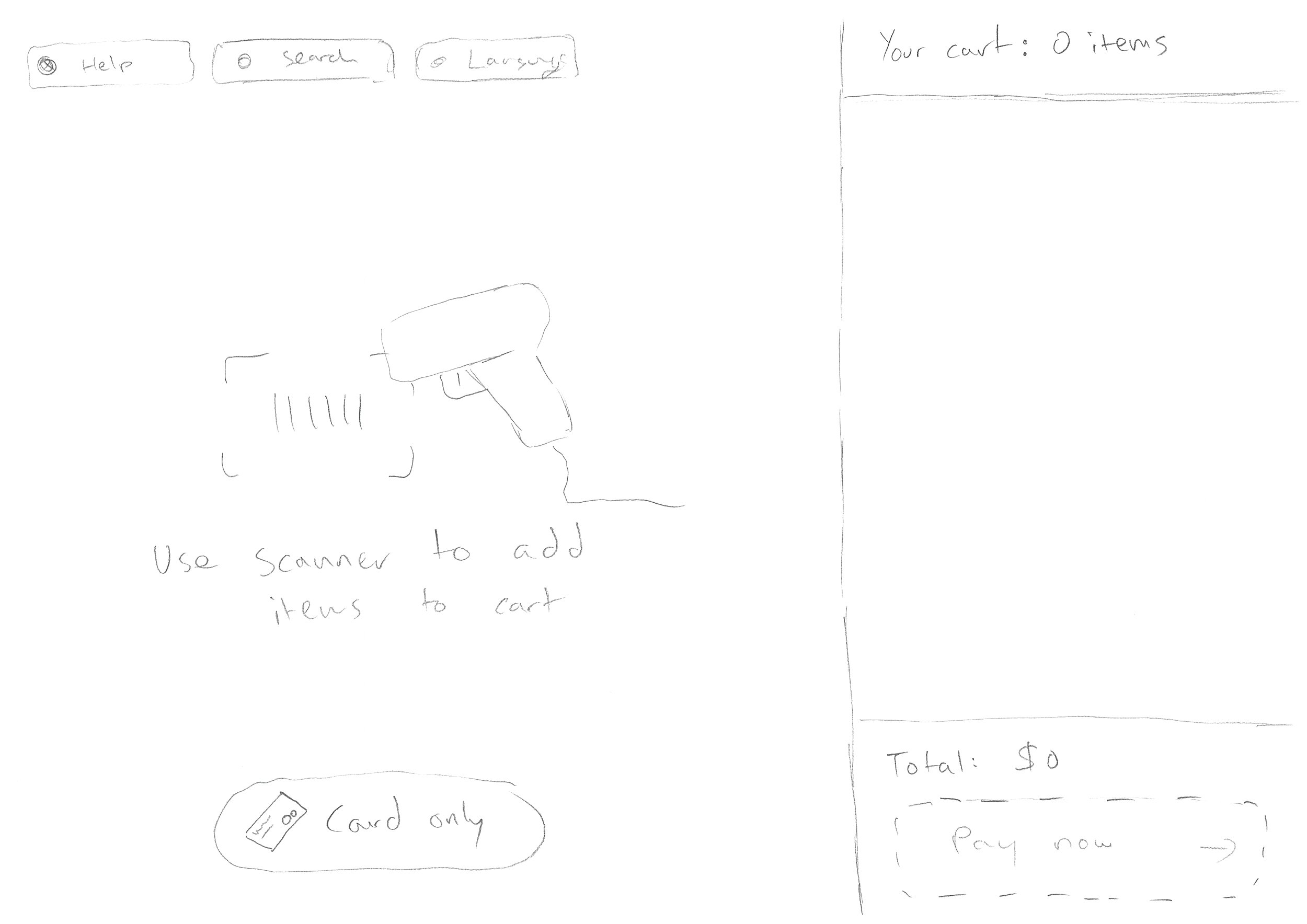
Rough sketches of design concepts from the early phases of the project
The full customer journey: scanning and adding products to the cart throught to payment and receipt options
Final thoughts
This was my first time designing a self-service checkout and it was a really positive experience. Spending the time early on with workshops and extensive research helped clarify our goals and shaped the final product. The team worked together extremely effectively and we continually got fantastic feedback from all business stakeholders.
We were able to introduce many new features to customers that were previously locked down to be for staff only, such as being able to delete items from the shopping cart. We also fixed numerous usability issues such as the clunky receipt option screen, and improving the experience for PowerPass trade customers.
I moved on from Bunnings mid-way through production, and unfortunately the entire project got shelved six months later for reasons unknown. Which is a shame because I think it was going to be a really innovative product that was far more user-friendly then their existing solution.
Want to work with me?
If you like this project, then say hello and let’s see what I can do to help you.


