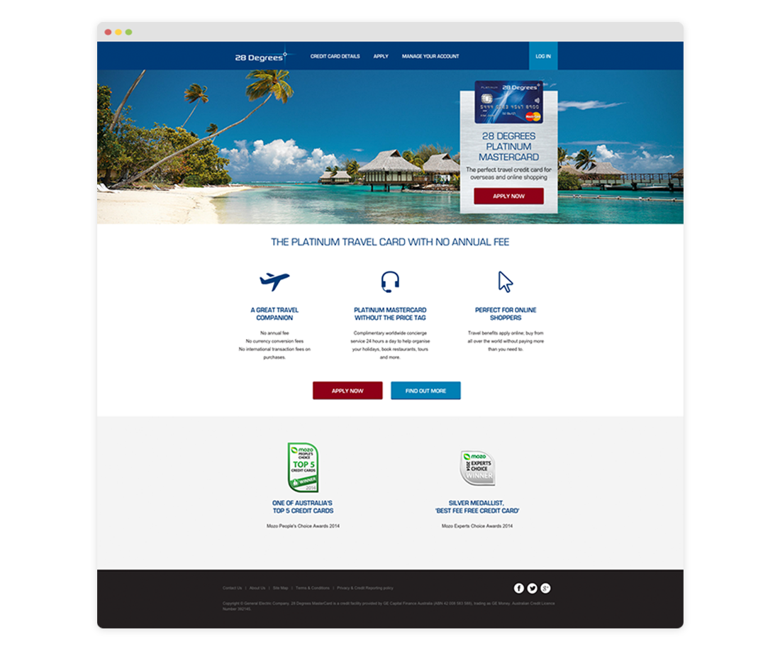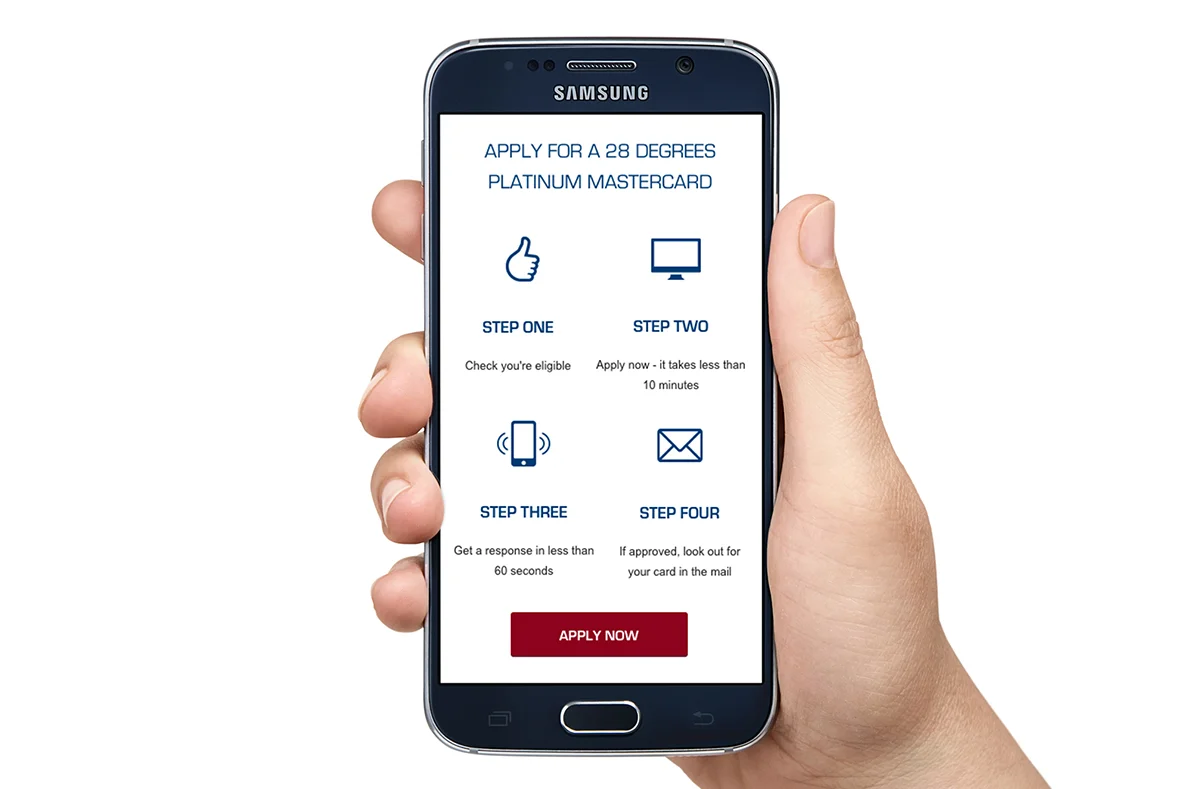
28 Degrees website
This project involved completely redesigning the 28 Degrees website (a platinum travel credit card) whilst working at Melbourne agency CHE Proximity. The goals were to make the site more visually engaging, improve the user experience, and to help drive sign up of new customers.
I was the sole designer for the project, and worked closely with the head of digital, project manager, copywriter, developers and account manager. The project was certainly challenging, as there was a need to stick to their brand guidelines which included quite dated iconography, colour palette and typography. However, we were able to drastically improve the usability of the site through an exhaustive process of simplifying the layout and structure, whilst focusing the user’s attention on the key calls to action.
Carefully chosen photography helped reinforce the card’s key selling point as the perfect overseas travel companion. And through the use of colour, texture, and improved layout and icons the site ticked all of the client’s goals. Even with somewhat dated typography, we were able to create a site that looked really fresh, modern and engaging.
I was bought into the agency as a freelancer specifically to work on this project. Upon completion I was offered a full-time position and stayed on with the company for nearly two years.
Client: GE / 28 Degrees (Australia).
Designed at CHE Proximity, Melbourne, 2015.
Manage your account: mobile view.
Before: The homepage before the redesign.
After: The homepage after the redesign.
Homepage: mobile view.
Credit card details.
Apply for a card: one of the most important screens of the whole website.
Apply for a card: mobile view.
Manage your account.
Want to work with me?
If you like this project, then say hello and let’s see what I can do to help you.


